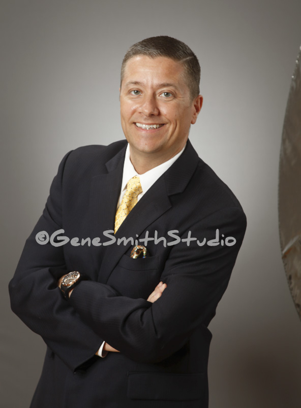
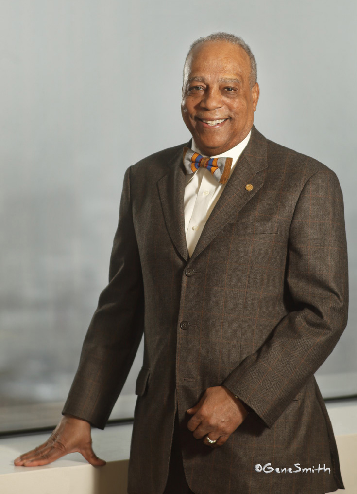
The value of a great portrait or head shot far exceeds the cost-
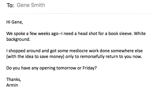
When you have a position where your picture represents your Brand it is crucial to make a great first impression. And many times the head shot you use is reproduced so small it really needs depth and dimension to look great that small.
Having a background in advertising photography where every image is created and optimized by a team of several experts I know what works best for each personality and look.
Don’t take a chance with your first impression-
You’ll never get another opportunity to put your “best face forward”.
Let me help you look your very best!
It’s the rage now to bring studio lighting out on location.
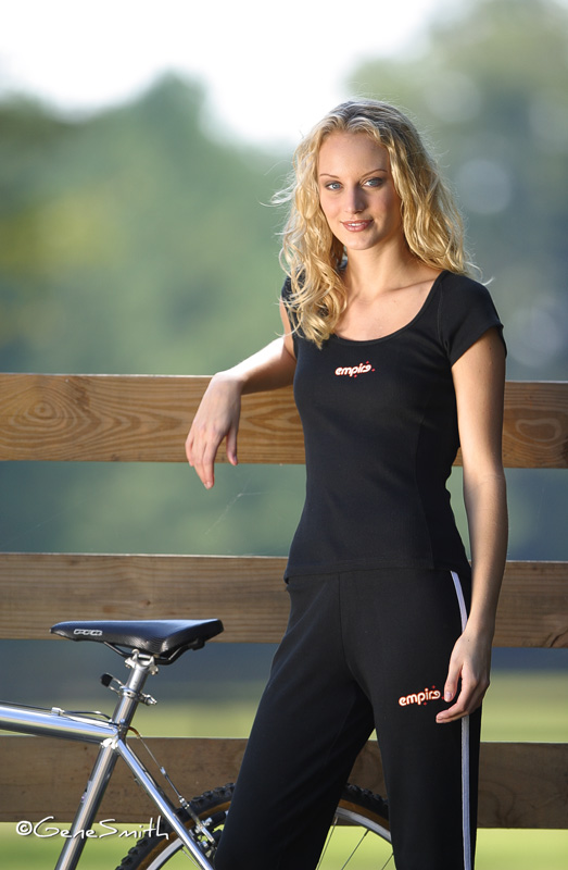
And modern HSS (High Speed Sync) battery powered mono lights make that easy as pie.
This photo was made 20 years ago for a fashion catalog on a horse farm in deep southwest New Jersey. I had enough cable that I could use my 117V AC studio packs and heads and the only concern was that they weren’t weather proof so I needed to be very cognizant of electrical safety. I insured that the packs and stands were all well isolated electrically from any of the folks working there with me.
The company I worked for at that time had a sweet Canon 300MM 2.8 telephoto lens identical to the ones seen on the sidelines of NFL games. The 2.8 aperture gives a dreamy out-of-focus “boeka” background that is best for isolating the subject and showcasing the product.
This was their first use of digital photography for the catalog and I had come onboard to make the transition from film to digital ‘capture’ seamless and on budget. The ‘photographers’ before me (and there were many) each had a dream camera ‘system’ and this company had bought one of each!
One of each expensive German, Swiss and Japanese cameras and unfortunately only one of each brand’s ‘normal’ lens to fit it! Of course a normal lens is next to useless for product or fashion work so we needed to settle on a camera system and a suite of lenses that fit.
I had used Canon since the middle Seventies when NIKON was king. Now Canon had taken the lead with digital cameras and that was because of their experience in office equipment and their computer interfaces. NIKON struggled at first with that aspect of digital equipment. That is no longer true today.
This picture was made with 6.3 megapixel Canon D-60. Today’s digital cameras hover around FIVE times that resolution at 30 MP. And this is my point- The image holds up- Why?
Having worked with 8X10 sheet film view cameras for the bulk of my product work I learned the hard way that camera format (film or digital sensor size), lens quality, and other equipment choices had little effect on a final result compared to crisp light, a functional lens shade, careful focus and aperture choice to reduce lens ‘diffusion’. I often wondered why some of my early 8X10 work didn’t impress. It wasn’t the resolution- 8X10 transparency film was tops and rivals some of the best digital photography. It wasn’t the lenses- they were all top quality and corrected for their intended use. It wasn’t the lighting equipment- I was using some of the very best studio strobes available.
It was my big, flat, soft light box, without accurate lens shading and poor design of color and contrast in the subjects.
You don’t need the very best equipment to make interesting photos. You need an interesting subject, careful lighting to match the mood, a steady tripod and most importantly something that costs next to nothing. A great lens shade that masks all the background adjacent to the picture to prevent lens flare. Either a dedicated bellows lens shade or black flats that cover everything that isn’t the subject.
It is often neglected because it isn’t expensive or exotic. But you won’t see a movie set camera without a carefully fitted lens shade. Those directors of photography know their craft and would never wreck a scene with unintended lens flare. Flare isn’t always evident. But it is always robbing you if you don’t control it.
Try both ways on your next picture project- you’ll be amazed!
New Advertising Photography for Marriott.
I got a call from the owners of several Marriott Hotels for some Architectural Photography in May and the project is finished and went live on the Marriott websites this week. Architectural Interior Photography is one of the first specialties I learned while still in college. The work was mostly Black and White in those days and to make color photos of interiors with film back then required a team of assistants and truckloads of incandescent lights resembling a movie set.
Today however a skilled photographer can make beautiful interior photos using digital cameras and digital retouching.
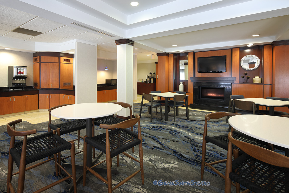
You can see the entire project here:
https://www.marriott.com/hotels/travel/aiyml-fairfield-inn-and-suites-millville-vineland/
Gene Smith Studio picked as one of Philadelphia’s 31 BEST out of 505 Philadelphia Portrait Photographers!
TOP TEN!
I got a message today from Forrest Kolb on the West Coast to let me know I was selected out of 505 professional portrait photographers in the Philly area to be NUMBER TEN in EXPERTISE’s TOP Thirty One!!!
What a thrill to get an unsolicited review like this!
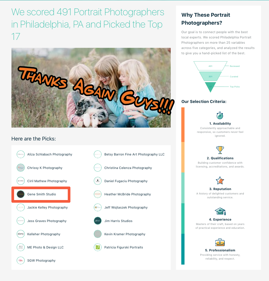
I got a message today from Forrest Kolb on the West Coast to let me know I was selected TOP FIVE out of 491 professional portrait photographers in the Philly area to be in EXPERTISE’s TOP NINETEEN!!!
WoW it is so great to get an unsolicited review like this!
‘Made my DAY!
https://www.expertise.com/pa/philadelphia/portrait-photographers
One ‘Gig’ leads to another!
I got a call to produce high end commercial illustrative product photography for the brand new WillsEye Hospital’s “WillsEyeWear” retail store in the Philadelphia Fashion District Mall on Market Street.
It was another great opportunity to work with Jeff Lynch a really gifted designer, in my studio making these images of Ray-Ban, GUCCI and VERSACE luxury eyeglasses frames.
These frames are so well made! Just handling them on our photography set made me realize there really IS a difference in luxury frames.
These images had to be made with great care as the final production will be over SIX FEET TALL- and unlike a billboard there is no restriction on viewing distance. We needed to be sure these photos would stand up to close scrutiny and boy do they!
We’re very proud of the result and hope that they kick-off Wills Eye’s new retail stores with a big-show!
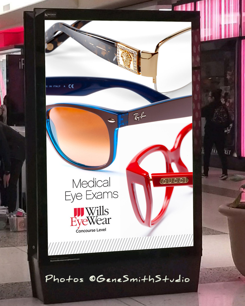
The kiosk is over SIX feet TALL!
Film?
I started in photography in the late Sixties when my Dad taught me how to develop and print B&W pictures in our basement darkroom. As my career grew (I sold my first Architectural photos while still in college) I became an expert in film and eventually had my own color transparency film processing machines at my Moorestown studio. That was a really BIG deal which gave me the advantage of giving my clients finished film to take with them at the end of a photo shoot. No other photographers in South Jersey and very few in Philly had this capability. It opened many doors for me.
Today there is a little nostalgia and interest in using film cameras for Black and White photography, and like the resurgence of vinyl LP records on turntables, some think it is better.
Better than what? Before we get all excited about film let me tap-the-brakes:
When film was king and all of my work for international corporations was made with individual sheets or big 120 sized rolls of E-6 color transparency film I struggled. I struggled less than my poor competitors who had no control of their film processing- But I struggled just the same.
Film was nuts-
There were many many types of color transparency film. And each box of sheets or roll of each type had a “personality” that was related to its manufacture. Each batch carried what was called an “Emulsion Number”. That number tracked each batch. The top commercial photographers in each region got first pick of the ‘best’ emulsions simply because they bought lots of film in bulk and stored the film in big chest freezers- Top photographers would get samples of the recent emulsions and test them. Was the film a little green? That would be great for landscape work but for an AD of an infant for Gerber? Not on my watch-
Kodak sold fragile little gelatin CC (color correcting) filters we would put on our lenses to try and bring substandard batches back into balance. It rarely worked well.
Add to this the processing. If you were not in the top tier of professionals in a region your film would be handled by folks at your lab who could care less about your assignment. It was just a $4.00 sheet of film to them so many of the lab workers were brutal. If you lost your film to a ham-handed worker you would receive a cheerful refund of the processing cost. Never mind that the prototype you photographed was back across the country and the models were on another project unavailable to reshoot and so on. The last straw for me was when Quaker Photo in Philly delivered my film with another photographers film stuck to mine from the dryer and completely ruined.
I was able to control some of this by processing the film myself but it was a long learning curve. Towards the end I had Bud Mills of Pro Color Lab the premiere photo lab in Philadelphia help me. He introduced me to the inventor of the KODAK E-6 process, Ken Neitz, who coached me until my film was the envy of all those who knew the difference. It was so good MATTEL stopped making DUPES of my best exposures and just had me provide extra frames for the Mt. Laurel, Manhattan and El Segundo CA locations. That was a money maker for my studio until MATTEL’s production manager got upset we were making her job superfluous. We went back to providing a range of exposures SHE could choose from and send out to Pro Color for DUPES-
Of course no one ever knew what the image would look like until the film was finished.
Ansel Adams invented his Zone System to ‘Pre-visualize” the effects of exposure, development and printing of B&W film and for many that was a life-long pursuit of excellence. It worked only for control of contrast in B&W work. Color work was still very character building!
Professional photographers ‘strapped’ a Polaroid film back on their cameras to get a tiny instant ‘preview’ of what the image might look like. The Polaroid test also somewhat helped check the exposure, framing and focus of the photograph. Somewhat– That tiny Polaroid and the transparency film rarely agreed. The Polaroid could stand a little more carelessness in exposure and lighting color that the transparency film would murder you for.
‘Remember I mentioned different types of film? Any time the light was anything but noon sunshine the Daylight film would rebel.
We had: Daylight film, Tungsten film, Infrared film, Orthochromatic film, Panchromatic film, B&W film, Transparency film, Negative film, Portrait film and towards the end KODAK actually released an Underwater film!
Architectural photographers couldn’t make a color photo of interiors with windows unless they ‘gelled’ (covered the lights or windows with colored gels) all the different colored light sources!
Character Building? Absolutely!
And FOOD photography?
Today folks make iPhone pictures of their lunch worldwide with pleasing results-
With film, a food photographer’s suicide was always a small step away. Expert San Francisco food photographers lived like KINGS!
I get a chuckle when folks rave about film today.
Believe me the film they are using is far from the quality stocks we had. There just isn’t a market big enough to throw away the substandard emulsions like in the old days so every roll finds a home.
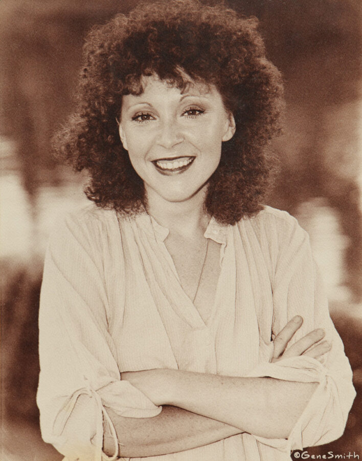
But on a positive note, here is one of my favorite portraits of musician and singer Cannell taken with 35mm B&W negative film over 40 years ago.
It was likely KODAK Plus X Film B&W developed in a Wing-Lynch rotary processor with KODAK HC-110 developer at 68 degrees Fahrenheit for 5 and a half minutes. The negative was printed with a Bessler 45M Enlarger with a Minolta 50mm Lens onto KODAK fiber based paper and toned with KODAK Sepia Toner.
There’s at least 9 steps that could go very WRONG- but sometimes preparation and craft win out.
JC Penny’s Instagram page featuring Gene Smith Studio’s photos?
Yep- All over the country these fashion frames are jumping off shelves!
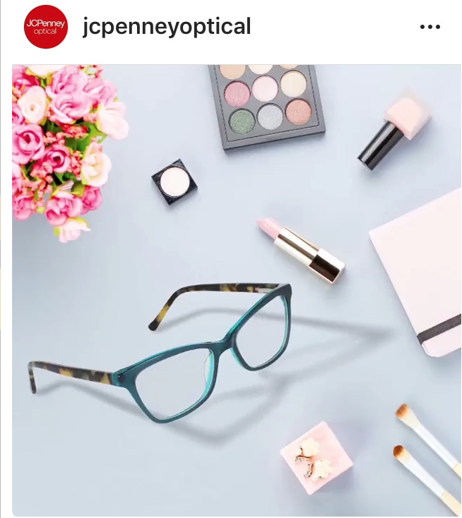
WoW- Seven Feet Tall ????!!!!

After working in the studio making specific photos for advertising it is always gratifying to get to see the final usage and production. Today I got a PDF from Jeff Lynch with the final production mechanicals for a Point of Purchase Displays for “meijer optical” that will be printed HUGE for towers in all of their retail locations.
I take great care in making these photos because they are so big and unlike billboards the viewing distance isn’t very far. In fact it is easy to walk right up to one of these seven-foot displays and look closely… Thankfully every step in the production was carefully executed and these displays SING!
Take a look at the design of all the imagery, typography, edges, folds, tabs and die cuts that make this flat printed piece spring to life in the retail environment- That’s Jeff’s work and he’s an expert!
I’ve done a lot of photography for package design and Point of Purchase displays and it is so rewarding to work with a strong team and make such tight renderings.
Making a six inch pair of eyeglasses frames go up to seven feet in a photo requires expert execution.
Testing Testing Testing
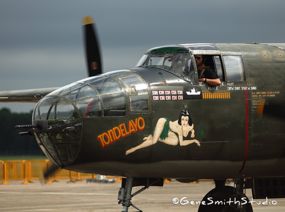
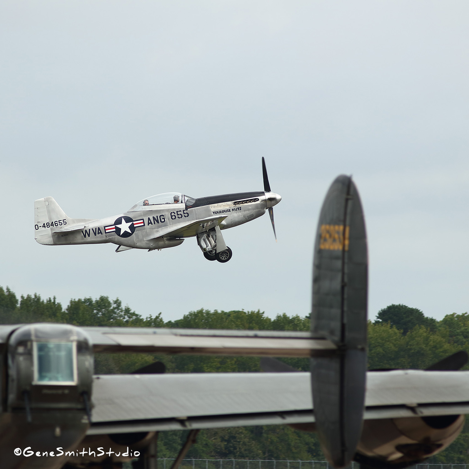
I photographed it at the Cape May, NJ Airshow.
As a professional photographer it is always necessary to stay up-to-date with the latest technology that clients and customers demand from me.
Often testing is tedious scientific work and learning new applications and new versions of classic apps.
But this post is about a fun couple of days testing my equipment, and also testing some of Canon’s high-end gear that they happily lend me through Canon’s CPS Canon Professional Services.
CPS has been a fantastic resource for Canon’s professional customers and I have been a member since the early Eighties when I qualified with my first published photography. At that time a photographer needed to provide three samples of published work and CPS was free. The service offered expedited repairs for pros and the CPS ‘loan’ program offering pros any Canon camera or lens to borrow for a week to evaluate. Canon’s not dumb and I try to remember a loan I didn’t follow-up with a purchase…
There’s nothing like a piece of esoteric gear to get a photographer inspired!
And no better outing to photograph than the bluster and beauty of old War-Birds!
UPDATE!
The world’s Best Advertising is Positive Public Relations!
What is the VALUE of a great professional photo?
To one of Phlly’s TOP accounting firms it is PRICELESS!!
A good customer of mine for years called me in August to set up a photoshoot. This woman knows marketing (and she is tops to work with).
She knows that when one entices the editors of magazines with fantastic professional photography, an opportunity for incredible Public Relations arises.
While we had hoped for some Press Release uses announcing the Firm’s new Minority Group we were absolutely THRILLED to get the news that-
ACCOUNTING TODAY Magazine was going to pick up the photos and- USE THEM ON THE COVER!
Ask yourself what is the VALUE of this for ANY firm?
Unlike paid advertising, a press release and especially a MAGAZINE’s COVER adds a level of credibility to any firm’s marketing and SALES plan.
Today, anyone can brag about themselves-
But when an industry’s TOP PUBLICATION says it ABOUT YOUR FIRM-
The value is P R I C E L E S S!
When you know what you are doing and want the rest of the world to know-
Do what top corporations do…
CALL GENE! (We win awards- FOR OUR CLIENTS!)

Accounting Today Magazine AGREES!
The Magazine picked up this photo of the new Horsey, Buckner & Heffler minority division.
‘Want to make that happen for your firm?
Call Gene!
Philadelphia EAGLES!
Many years ago I had an assignment to create architectural interior photos of the (then) new EAGLES Nova Care facility for the company that engineered all the AudioVisual equipment. We broke for lunch and what a surprise!
I’ve had many memorable assignments but I’ll never FORGET dining in that EAGLES cafeteria!
There were a half dozen themed food stations- Thanksgiving, Sea Food, S T E A K, Italian, and on and on each with its own chef!
The lunch was DELICIOUS and the portions were Champion sized!
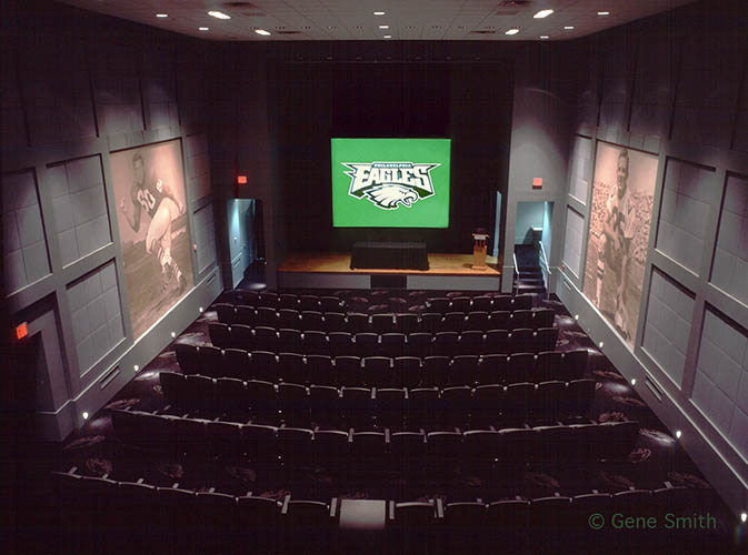
It was really fun to photograph the huge EAGLES theatre where the players studied the game films.
The theatre SEATS were TWICE normal to seat the huge lineman and everything was first class!
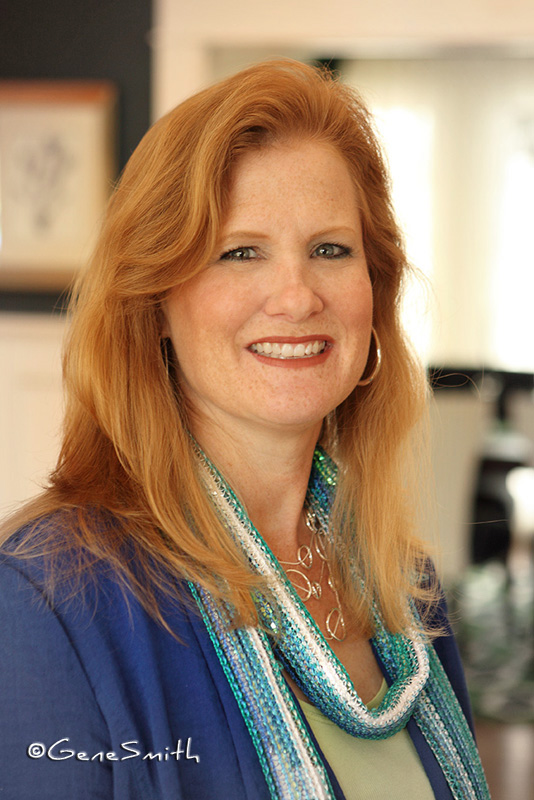
The Real Deal in Professional Headshots
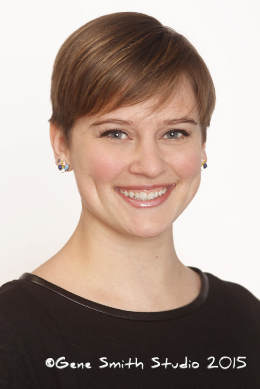
I had the great pleasure of working with a professional casting director on a very big project last month.
During breaks, at lunch and while waiting for props and make-up we discussed what he thought about actor’s headshots.
I asked him what he saw in a headshot and if there was anything actors could do to get called-in AND HIRED.
I was surprised to see some of the headshots he had pulled up from his search for actors we used in this project.
Many were satisfactory- But the number of laughable snapshots some folks sent in only to be trashed was amazing.
And they were not considered for the project.
Not only did the snapshots not feature the actor in her best light, they showed a lack of professionalism that not only jeopardized the actor’s payday- but an undependable actor not showing up ready to work jeopardizes our whole team.
The costs in renting a location, travel of clients, photographers, stylists, make-up artists, editors, production teams, renting of props and other expenses all rely on a fully functioning team.
These costs are lost if the production stops. No one can take a chance on a no-show or unprepared teammate. Those with substandard headshots weren’t even considered. Their lousy headshots projected a sloppy unprofessional image.
I asked the casting director about styles in headshots.
I asked him what he thought of the headshots on my website.
I asked him what I could do to make my headshots stand out for my customers.
He told me:
“A headshot should represent the actor.” That seems simple enough…
What he really meant was it should be a real take on the actors face.
No heavy make-up should be used that could distort the actual complexion of the person.
The planes of the face need to be rendered so the casting director can see all the features.
NO extreme digital retouching should be used either. Remember- A great director of photography can use lighting to create a mood and or slim a face and professional makeup artists can hide blemishes-
But in a moving action scene the truth comes out. The camera follows the subject in and out of the lighting and the truth is exposed.
Automatic digital retouching that many headshot photographers use smear the features and complexion of the actor. They end up looking like tired old plastic surgery!
Professional casting directors recognize these Photoshop plug-ins immediately and sadly it is often a deal breaker for the actor.
I rely on my decades of experience, very special portrait lenses, glamour lighting, posing to accentuate the positive, and my experience in photographing advertising for national and international campaigns with many top art directors, to create a great headshot portrait.
The result is calls for auditions for my headshot customers.
Take a look at the headshots on my web pages. I’m happy to say there is nothing special about them…
The special thing is how fantastic the PEOPLE in them LOOK!
Many are regular folks in business that want to look their best for Linkedin headshots and Facebook headshots or for their business’ website.
Some successful folks even want their passport photos to reflect their success.
Many are actors who come to me and return to keep their CASTING headshots CURRENT.
Others- like several this year, are those who have been to another studio only to try and forget that experience and pay me (again) to make them look great.
I was able to see firsthand what happens when an actor does not update her headshot-
The casting director called in a woman who had sent in her outdated headshot.
The director was looking for a mid 30’s woman to play a nurse.
When she arrived it was plain that her 30’s were a distant memory.
It was sad all around…
He told her-
“I’m sorry your headshot isn’t current we were looking for someone younger for this role.”
That for sure is disappointing-
But what came next is crushing. He added-
“You would have been perfect for one of the principal roles we cast LAST WEEK”.
Ouch.
Whether you are a professional actor or just want to look like yourself on one of your very best days-
An expert headshot by a photographer who works in the business is your best option.
I’m often asked how often someone should get a new headshot.
The answer is simple.
Whenever you get a new look in hairstyle or a change in your weight and in men a change in your beard it is time to show that in a new headshot.
Child actors need to get their headshots changed often.
For busy successful executives I like to tell them-
New car?
New Headshot!
Look your honest best-
Call Gene
Philadelphia 76ers!
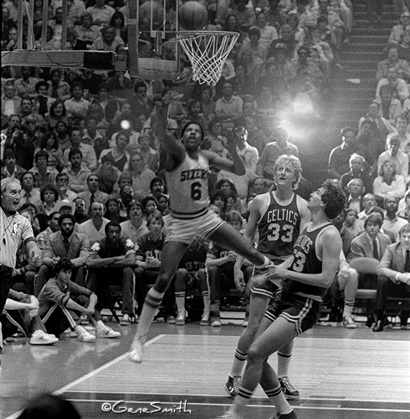
How ‘Bout the Philadelphia 76ers!
I’ve been a rabid Sixers fan since I was in middle school.
That’s a half a Century!
When I was in seventh grade my classmate named his dog Hoopla. That’s how much we loved the 76ers.
And what a lineup they had-
Wilt Chamberlain
Larry Costello
Billy Cunningham
Ron Filipek
Johnny Green
Hal Greer
Mat Guokas
Luke Jackson
Wali Jones
Bill Melchionni
Jim Reid
Chet Walker
What a TEAM- The 1967 Sixers had a 68-13 Record!
And they BEAT the San Francisco (formerly Philadelphia) Warriors for the NBA Championship!
This was the second NBA championship for the Sixers having won as the Syracuse Nationals in 1955.
It wasn’t until 1983 when the Sixers SWEPT the LA Lakers in FOUR Games that Philly had a national champion again.
Here’s a photo of Dr. J (Julius Erving) showing Larry Bird of Boston Celtics how it is DONE!
GO Sixers- it is a good time for another Championship!!!
Here is a promotional piece I made in the early 90’s for my Gene Smith Photo in Moorestown. It was originally a magazine assignment.
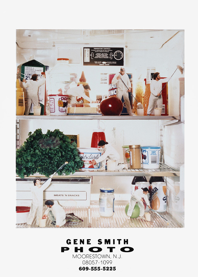
Back then we used film and there were so many different experts in the Graphic Arts field that had decades of experience making the different steps in an ad campaign or magazine layout.
Today these Graphic Arts professionals are taken for granted but we must remember one thing:
When it took many many years of apprenticeship and study to learn the different crafts in graphics production, artists refined their skills in art and design. Sadly today those steps in excellence are lost.
It took great skills to make the different steps required to create a photo illustration.
This photo was commissioned for a health magazine piece and I was lucky enough to be able to get my customer to help with the production.
First we decided on the concept of little janitors cleaning a home refrigerator.
Then we needed to get the Tyvek suits for the models. I wanted to make it easier to cut out each model so the suits made for a consistent edge for my knife. If I cut a little too much the suits hid the error.
We photographed each model (I’m here too!) in a pre-determined position to match the items in the fridge.
Then I printed each photo in my darkroom at a scale that matched the groceries in the fridge and I painstakingly cut out each person and their mop or pail with an Exacto knife- Yep I had made extra prints because I knew there would be mistakes.
The cutouts were then positioned in the fridge and re-photographed.
Since the photos were flat and glossy to retain sharpness, contrast and color, glare was a huge problem…
I used an old photo technique “painting with light” to evenly light the fridge and carry the existing light to make the shot look natural without glare.
To do this we needed to darken the room, put the camera on a strong tripod and leave the shutter open while I “painted” the scene with a moving flashlight!
Remember- no preview as we have today with digital cameras.
As you can see the results are fantastic-
All without a computer or digital camera!
A Call Back for New Photography at Philly’s Top Accounting Firm
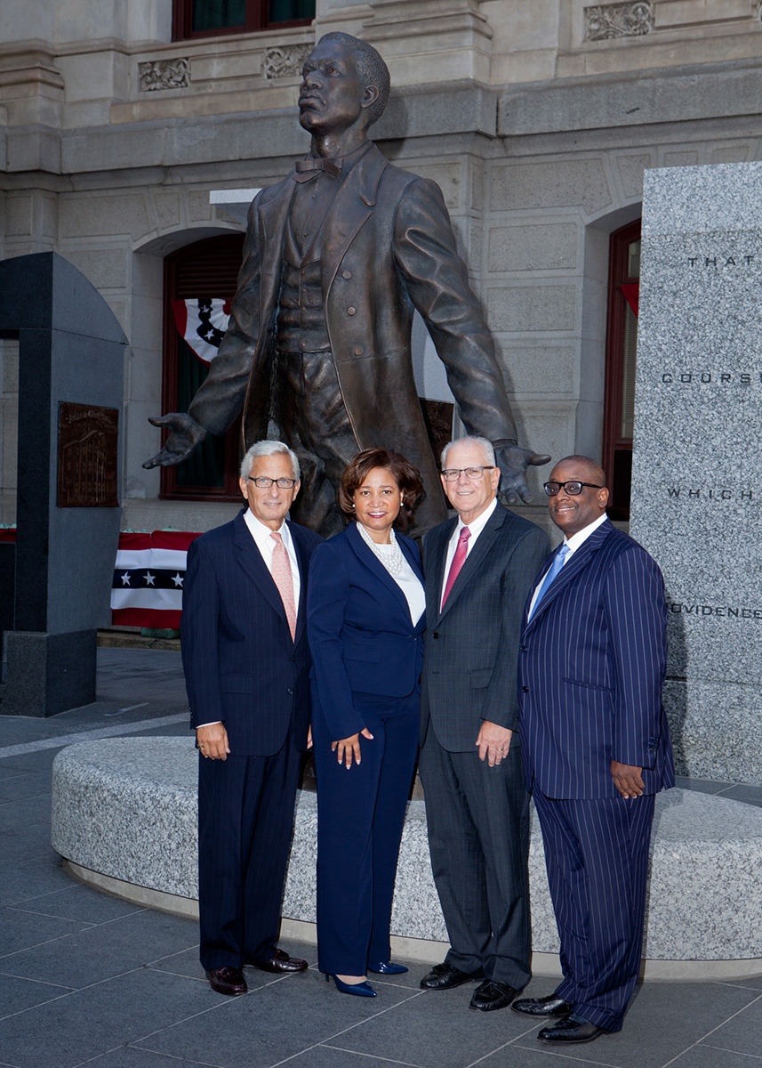
I got a call from Heffler, Radetich & Saitta, LLP to photograph their new minority CPA firm Horsey Buckner & Heffler LLP to show the new team and Heffler’s principals in a group photo. Working in the City in a public space has its challenges and this photo was no different. When we arrived there were girls from a high school helping folks to register to vote. It was also lunch time and people were enjoying the stellar 75 degree mid-October weather. I had my location lighting and we set up a very informal group featuring the huge new bronze statue of newly re-discovered local hero Octavius V. Catto by artist Branly Cadet. The sculpture is the first public sculpture raised at City Hall since John Wanamaker, Citizen was dedicated in 1923.
It was a great time working with old and new friends from Heffler!
New Corporate Portraits for Advanced Oral Specialty Group
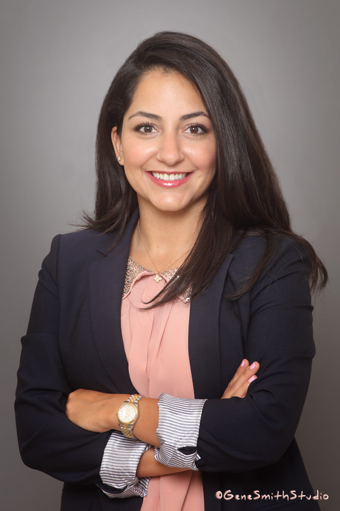
I had the pleasure of photographing the staff of Advanced Oral Specialty Group at their location in Voorhees, NJ last week and what a fun time we had.
The team is lead by Alan M. Meltzer, D.M.D., M.Sc.D. and here is a new portrait of Dr. Mina Ebrahimi Daryani, D.M.D.
Dr. Daryani is just as gracious and competent as her pretty new portrait shows.
Electric Racing Hugely Popular in Germany
Years ago I used to photograph all the Matchbox brand cars, trucks and play-sets for MATTEL.
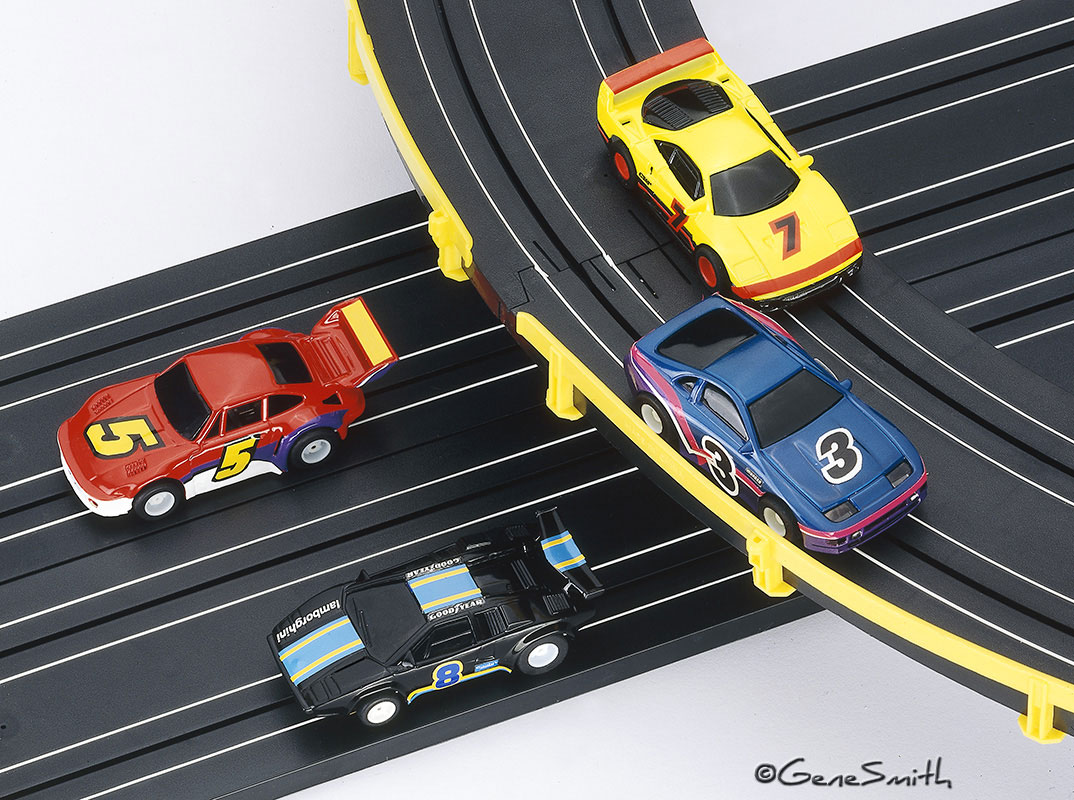
It was a lot of fun and challenging to render the cars and sets often with child models having a ball.
I also had the assignment of photographing the Electric Racing series which we photographed with 8X10” color film transparencies. We never knew we had a satisfactory photo until the film was processed.
I had enjoyed slot cars as a boy and we had a lot of tricks to make the photos that graced the BIG 42″ boxes look fantastic. At that time Mattel had a dedicated “race room” where the toys, often priceless prototypes, were prepared for photography before production models were available.
We used no retouching and Photoshop had not yet been released to the public yet. There was one firm in Texas that could digitally retouch some things and their costs started above five thousand dollars…
I remember all of those little plastic flag poles that lined the HO Scale tracks. I also remember the tedium of getting each flagpole straight and then straight in the camera!
One trick we used was to have MATTEL’s Race Room exchange the metal rails in the track with white plastic strips that photographed well at all angles.
Often we worked to pre-approved comprehensive ad layouts and there was never room to ‘improvise’.
I stretched the boundaries on this photo however and placed the Datsun ahead of the Ferrari and the Porsche ahead of the Lamborghini!
It was so much FUN to see that electric racing is alive and very popular in Germany today-
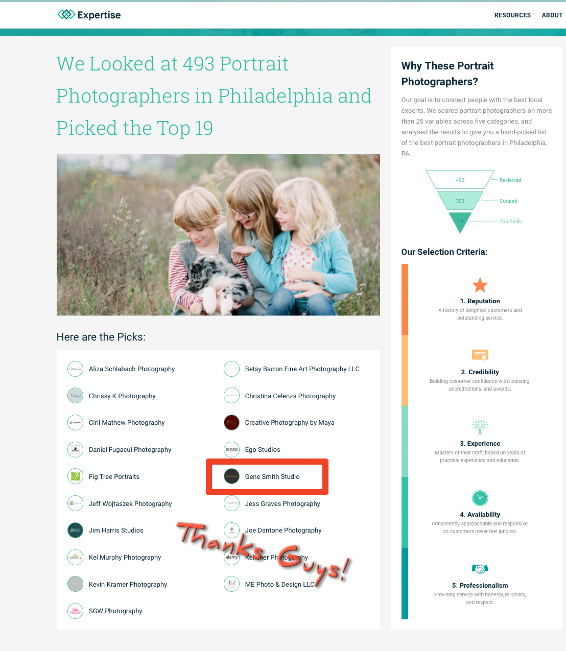
“EXPERTISE” Picks Gene Smith Studio as one of Philadelphia’s TOP PORTRAIT PHOTOGRAPHERS!
I got a message today from Forrest Kolb on the West Coast to let me know I was selected out of 493 professional portrait photographers in the Philly area to be in EXPERTISE’s TOP NINETEEN!!!
What a thrill to get an unsolicited review like this!
https://www.expertise.com/pa/philadelphia/portrait-photographers
https://www.youtube.com/watch?v=tr2iPlVZ2nM&feature=youtu.be
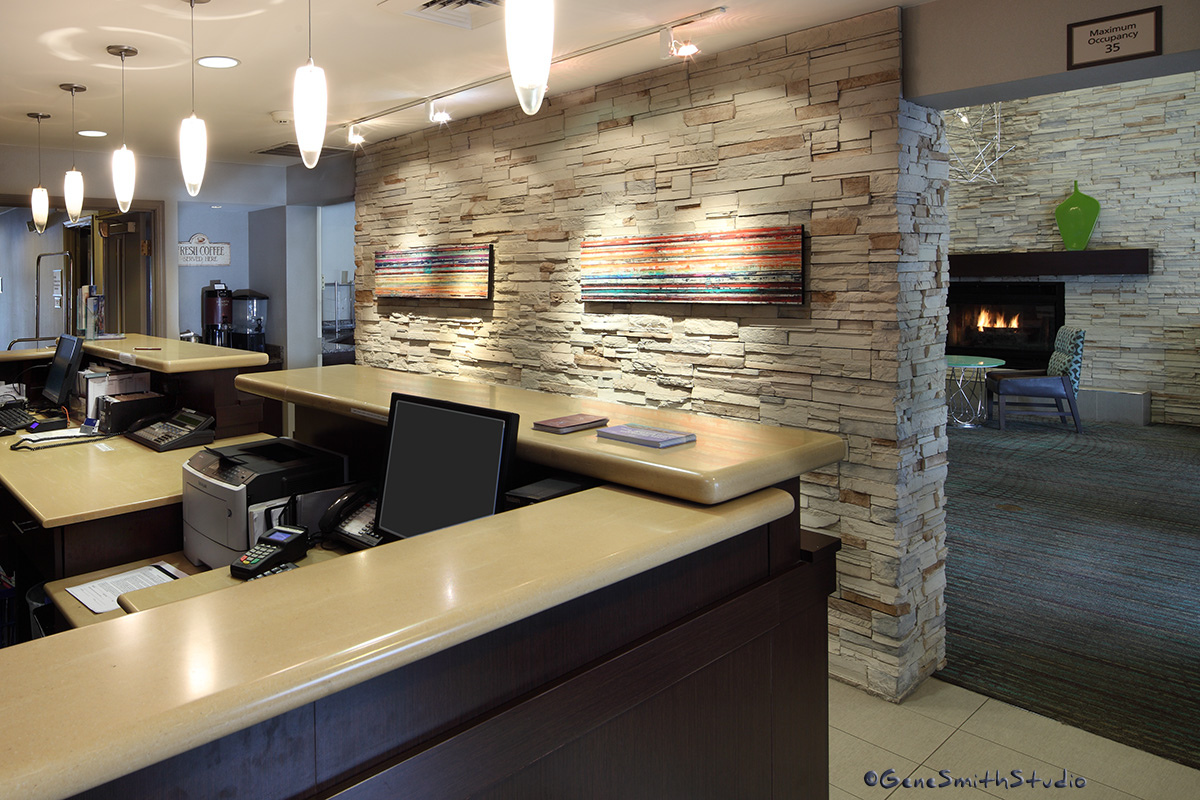
Interior Architectural Photography for Marriott Residence Inn, Cherry Hill.
I got a call from Marriott to photograph their reception area for the company’s websites and collateral materials.
I used a very special 17MM tilt/shift lens to capture the skinny space without the distortion one usually gets with an ultra-wide lens. I was able to get exactly the composition Marriott wanted and the manager was very pleased–
“Simply incredible. I am very impressed. You have a real passion for what you do and it shows in your work.”
That makes my DAY! Thank you Catlin!
Interior Design Photography.

Suburban Family Magazine has been running ads from Designer Draperies the last few issues that feature the interior architectural photography I made for them several years ago.
This magnificent home is located on one of the lagoons in Ocean City New Jersey. It has several deep water boat slips behind. It was so fun working there and of course working with Debbie Hall for the photoshoot-
Here is the final May 2017 Car Biz Magazine cover photo- I was pleased they picked my favorite image from the assignment.

Brian Bates, Holman Auto Group CEO photographed for CAR BIZ Magazine.
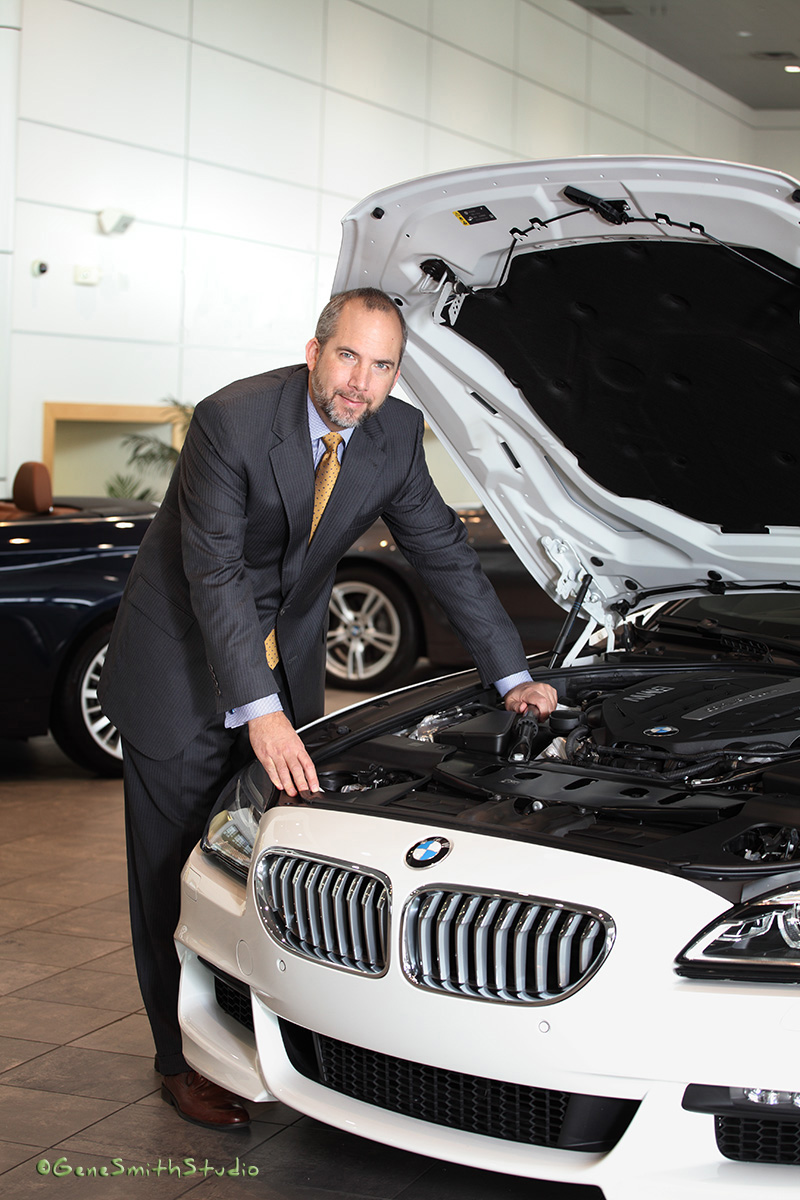
I had the pleasure of photographing Brian Bates for Car Biz Magazine this morning.
I met Brian at our local Cars & Coffee events and it was pure pleasure when I got the call from Car Biz Magazine to do a layout of Brian in his element for a nice Bio piece in next month’s issue.
My contact at Holman, Mary Welch, made everything go smoothly and I had scouted this location last week as the BMW store is only a few miles from my place.
Brian is not only a corporate CEO he is also a ASE certified auto tech!
You GO Brian! I look forward to seeing you at Cars & Coffee!
My Very first Architectural Photography assignment 1975!
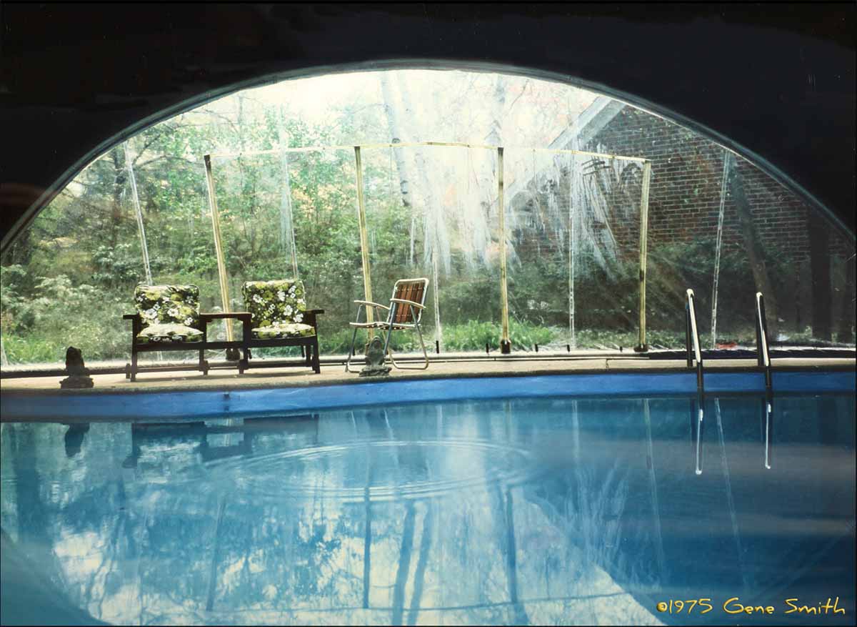
I came across the very first Architectural Photo I made many years ago recently.
It is of a tent pool enclosure. The enclosure was designed to get past zoning laws because it is a “temporary” structure.
When I was setting up my camera a drop of condensation fell into the pool making the rings in the water. As I prepared to make my exposure I remember throwing a dime into the pool to get the rings- I also remember wishing I had a penny instead!
I used a Crown Graphic 4X5″ camera with a 6X9cm roll film adapter. I had a Schneider Super Angulon 75mm lens that just barely covered 4X5″ so it was really nice cropped a little for 2 1/4 X 3 1/4″ on 120 roll film. I only used Ektachrome in those days. The shutter must have been over a 30th because the rings are frozen.
WoW FORTY FIVE years ago!
Using Portrait Specific Lenses
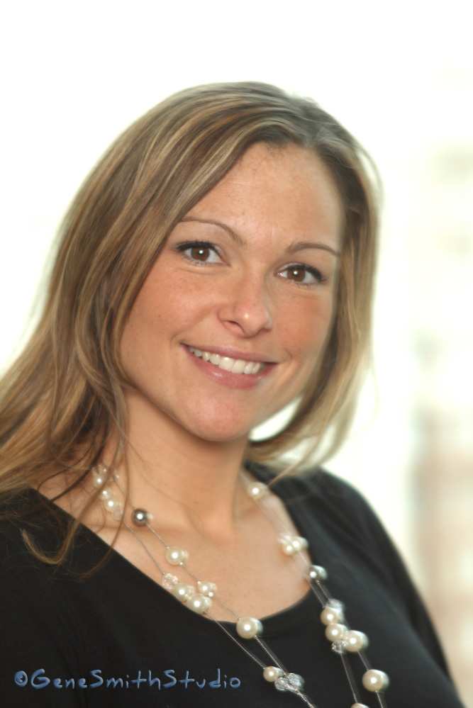
I use several new and some no longer available portrait specific lenses to make my portrait subjects look their best without resorting to heavy-handed digital retouching tools that ultimately look phony.
The reason so many ‘selfie’ portraits look lousy is simply a matter of perspective. To properly ‘render’ the human face a skilled artist or photographer will make the image from a certain distance. Many photographers understand that an 85mm lens fills the frame while giving the most pleasing perspective of a person’s face. If the 85mm is not available the knowledgable photographer will step back and later crop the image to represent the same pleasing perspective without all the distraction of a big background. Longer than 85mm lenses are often used to create wonderful lens Bokea, the dreamy blurring of the picture’s background that a telephoto lens excels at. This also brings attention to the subject because the eye (and brain) naturally go to the part of an image with the best focus. The subjects closer eye iris will still be tack sharp. In front and behind that focus point focus falls off. We usually don’t see the flattening of perspective as undesirable with very long lenses compared to the distortion a wide angle gives. Most glamor magazine covers are made with longer lenses. If the ear and hair are out of focus- you can bet the lens was 180mm or longer. Of course a wider lens is fine for full length or group photos. Remember- it isn’t the lens that creates the perspective. It is the distance between the lens and subject that determines perspective. The lens’ focal length simply allows the photographer to include or limit what is in the frame from a given distance. In fact, if you view a print made with a so-called fish-eye lens, a very wide angle lens, with the print just an inch from your eye the perspective will be rendered ‘normal’!
Perspective is not adjustable. Only point of view and viewing distance to the screen or print is flexible…
If you have ever seen the fantastic portraits by George Hurrell of Hollywood movie stars you are already familiar with the magic of real soft-focus lenses.
http://georgehurrell.com/2011/06/29/greta-garbo/garbo-tif-2/
The goal is to soften skin pores without making a smeary/blurry shot with no snap or contrast. A combination of make-up, pose, lighting, lens and of course some airbrush retouching come together to create the perfect effect. And few after Mr. Hurrell have been able to match his skills!
Authentic soft focus lenses are not corrected for Spherical Aberration anomalies. Soft focus lenses use the optics natural spherical aberrations to the photographer’s advantage. Usually these lens aberrations are carefully removed or ‘corrected’ in modern high quality camera lenses. The painstaking calculation and manufacturing expertise needed to eliminate lens aberrations makes today’s computer designed lenses the best ever. A fine portrait, however, does not always lend itself to the critical sharpness a photographer wants in a landscape or product photo. No one wants Hubble Telescope sharpness of the pores in their face. Simply making an out-of-focus photo is not the answer either. A light smear of Vaseline on a lens filter or glass suspended in front of the ‘taking lens’ is a better choice. Even better is so-called soft focus filters that come in many styles and price points. The very best of the filter style soft focus filters is the well engineered Zeiss Softar. The Softar uses ground dimples in the glass filter to gently imitate the aberrations in a real soft focus lens. The effect is variable with several strength Softars to suit different lighting and subject values. A Softar WILL reduce sharpness and contrast overall and that is a downside real soft focus lenses eliminate.
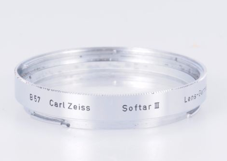
These Softars were a lifesaver for medium format film photographers.
The best solution is to use a dedicated Soft-Focus portrait lens. The concept is hard to grasp at first. The difference between real soft-focus and out-of-focus has to be experienced to be understood.
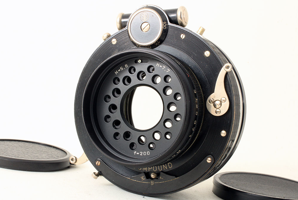
Here is the grand-daddy of all soft focus lenses the venerable Imagon lens by Zeiss Germany.
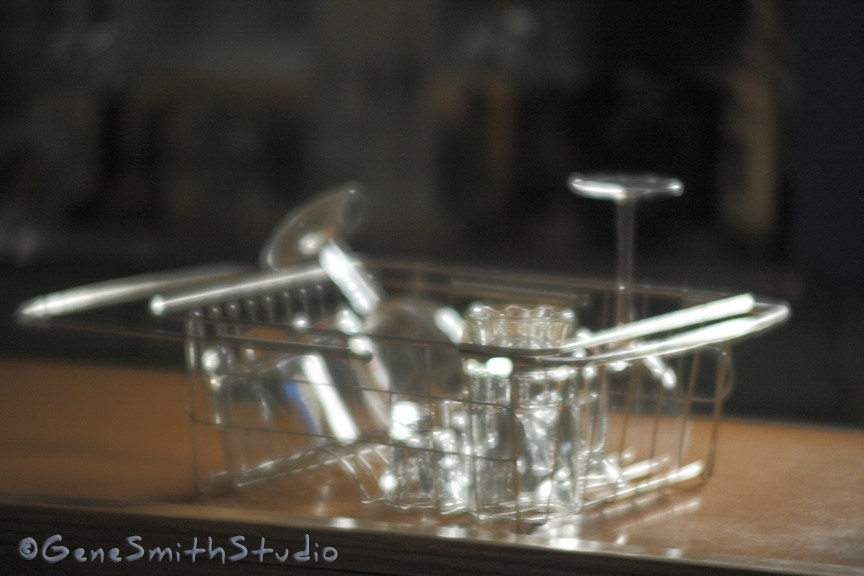
And here is the effect a true Soft Focus lens gives-
This is the maximum effect. Note it isn’t out of focus or muddy.
The Spherical Aberrations do all the magic.
Again, here is a simple portrait, no special lighting or makeup, and no digital retouching. The same Spherical Aberrations render a portrait that is real and sublime.

Here we can see the effect of true soft-focus. There is no digital re-touching. The lens used here is adjustable for different levels of soft focus. Note how natural and glowing Colleen’s complexion is. The give away for experienced photographers is the gorgeous glow coming from the white necklace… There is no way to get this effect with automated Photoshop plug-ins some folks rely on.
A truly talented DIGITAL ARTIST could emulate this effect- but without a reference photo, the visual cues of a manipulated digital photo would be evident destroying the effect. We are all familiar with the smeary, wax museum look of phony digital ‘enhancements’.
A real soft-focus lens overcomes this.
Glamour lighting, crafted posing and old-school soft focus optics coupled with modern digital tools are the answer for portraits that make the subject look great AND REAL.
When you are in need of a photo that makes you look your best please remember me.
You’ll look great and it will really be YOU!
Photographing Automobiles
I’ve been photographing cars since I got my drivers license. I’ve photographed the Matchbox, Hot Wheels and Electric Racing Sets for Mattel for years in the studio and you could say I’ve photographed more cars than most photographers…
Real cars are the same if not easier-
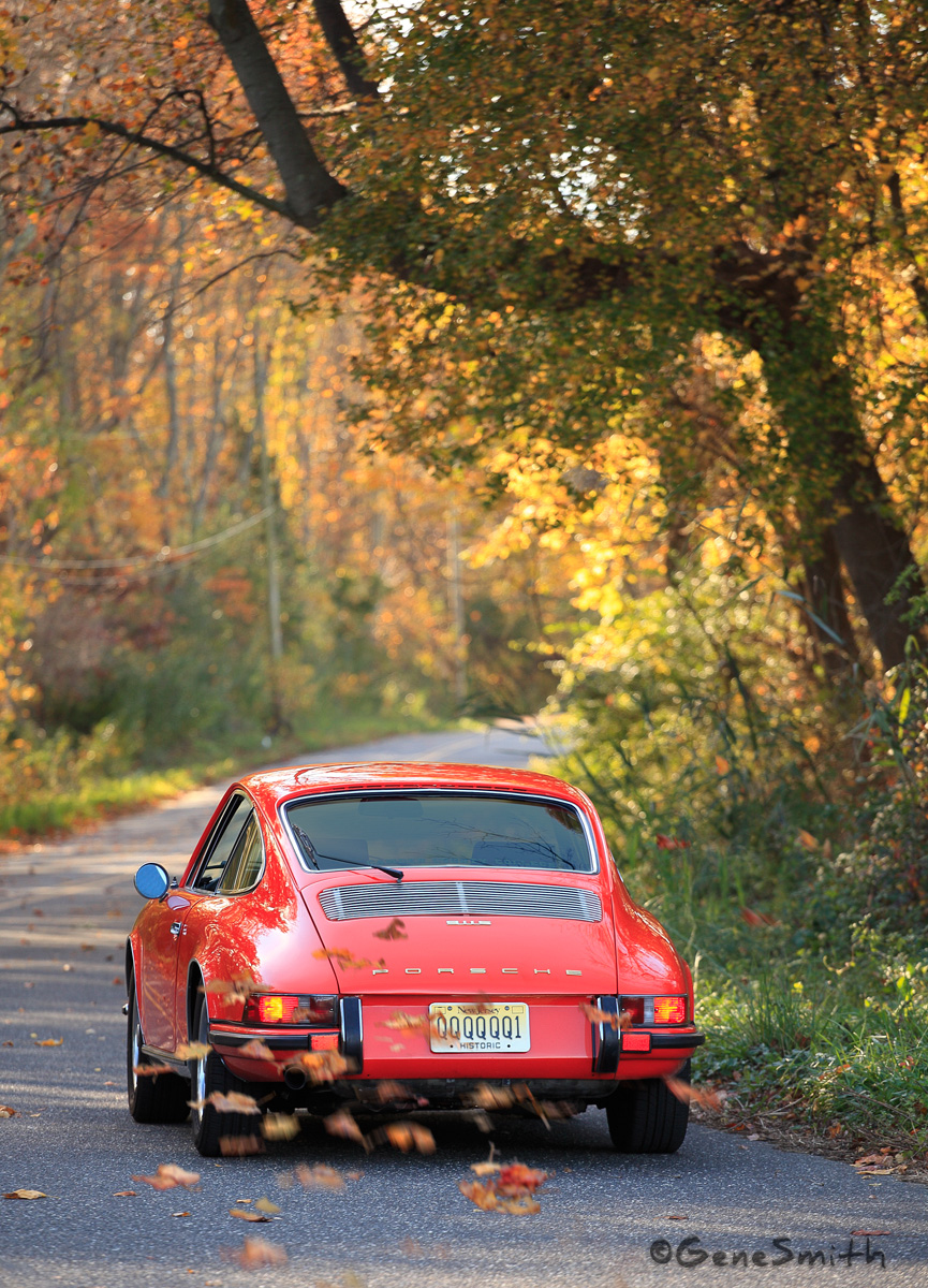
There are many techniques used to photograph a car. The automobile has many features that a photographer can exploit for a pleasing photo. The bright colors, reflective surfaces, contours, line, shape, pattern, texture, form and of course contrast and color can all be used to tell the story the photographer wants to tell. This photo, to me, tells a story of freedom.
A country road, no one around, great weather and visibility and a classic sportscar to enjoy it in.
Nikon is laying off workers?
https://www.dpreview.com/news/4455533041/nikon-reportedly-eliminating-1000-jobs-in-japan
Many, many years ago I choose Canon cameras.
At that time most serious 35mm film photographers used Nikon cameras and it was said Nikon cameras were designed by photographers and Canon cameras were designed by engineers… Some thought Canon lenses were closer to the superior German lenses in sharpness and contrast, and some thought the Nikon lenses had better color rendition.
Truthfully, had I choose Nikon I’d have had far more opportunity to borrow great lenses from the huge number of folks I knew who used Nikon. Fast forward 15 years and I was looking at trashing ALL of my Canon cameras and starting over!
Canon had announced they were going to change their lens mount to accommodate the newest auto-focus technologies. The old trusted Canon FD mount was not big enough to accommodate the future designs, and we the photographers needed to pony-up and buy new equipment.
To say that I was FURIOUS would be an understatement!
This was a disaster for me.
I was using mostly big 4X5 and 8X10 studio cameras in my still life and product studio. My ‘walk about’ cameras were Medium Format 120 film sized cameras.
My Canons were rarely used. The 35mm format was looked down on by most art directors I worked for as amateurish- (it was NOT)
AND the Ekatachrome film I used in order to deliver a product in a day or so was also substandard. Kodachrome was acceptable, but, except in Manhattan and Los Angeles there was no quick processing. Kodachrome also was less sensitive to light and it’s 25 iso (asa) speed made it useless for sports, available light portraits and other work except still life for which I had the big studio cameras that controlled perspective at my disposal.
The new flagship EOS Canon cameras with their new bigger lens mounts came out and a new set of lenses started to populate the line. These cameras had fantastic auto focus and the lens designers at Canon concentrated on the BIG, long, BRIGHT telephotos first, and painted them WHITE.
These were the cameras and lenses we all became accustomed to on the sidelines of NFL and NBA games. All of a sudden it seemed everyone was using Canon.
Nikon kept up and it all the Nat Geo photographers kept their Nikons close.
Sports and fashion photographers jumped ship and went with Canon.
Remember- We never saw our pictures until they came back from the lab…
Exposure was a black art. Ansel Adams invented a Zone System to control contrast by exposure and it was effective for black and white work. With tricky color transparencies needed for magazine work?
No WAY.
Most photographers took a series of photos at different settings- ‘Bracketing’ their exposures. I was spoiled- the huge cameras I used in the studio had Polaroid adapters so I could see a quick snapshot and confirm exposure and framing. But 35mm cameras had no way to strap on a Polaroid. There WERE modified 35MM cameras that made Polaroid pictures but the image was so small they were next to useless. These Polaroid cameras were expensive, and one needed to swap the lens between the Polaroid SLR and the film SLR maybe disturbing focus or framing… They were ghastly.
Nikon had one big advantage- Nikon had a little computer in the camera and it was linked to their ‘Matrix Metering’. The camera looked at the brightest spot and the first discernible shadow and compared it to a database of picture styles-
Eureka-
I bought one of these new Nikons with their MATRIX metering because I had a big assignment coming up that had to be 35mm slides and flash too. I couldn’t bracket because I would be photographing children and believe me when you bracket- the best expression is never the acceptable EXPOSURE! It was still years before I had my own color lab and could change the exposure value during processing with a clip test…
The Nikon performed flawlessly.
Imagine laying almost a hundred processed 35mm slides on a big light table and EVERY ONE A KEEPER! My client was thrilled-
Soon after, the Digital Revolution was brewing. KODAK made a digital camera available on a Nikon or Canon platform that delivered a 6-megapixel digital file. There was NO LCD preview screen- It was $28,000!
I knew this camera would be obsolete before the door closed behind me at the camera shop!
Canon and Nikon were starting to make their own digital pro cameras in 2002 and I needed to pick a platform and drop serious money- Canon seemed to have a big jump on Nikon. The Nikon Matrix computer aside, I felt Canon’s huge presence in copiers and office products meant they had the resources and experience in the electronics and computer end of the business. Canon had caught Nikon and was ahead in Digital resolution wars. Canon already had a cursory understanding of computers and software- Nikon seemed to have none of this experience.
I sold my Nikon system and again picked up the Canon line.
I’ve never looked back. But I still love the Nikon Cameras and their beautiful differences.
Nikons seem more ‘pictorial’. Maybe it is the artists that gravitate to them… The Canons seem ‘too accurate’ and maybe a bit sterile. The Canons will make a RAW picture file to die for- It is up to the photographer to make it ‘pretty’.
Back to the engineers designing Canon and photographers designing Nikon.
Good Luck Nikon- I know without you Canon will never work as hard.
Expanding photography skills.
Marc Levoy is a scientist, architect and digital photographer who is also a Professor Emeritus at the Stanford University Computer Science Department. Mr. Levoy has graciously shared his Lectures on Digital Photography from Stanford University and they are available for anyone to view on YouTube. Anyone who is interested in digital photography should take a look. I have studied all eighteen of the hour-and-fifteen minute lectures and I can attest to their accuracy and in-depth presentation of the scientific and pictorial history of photography. If you have an interest in photography you may want to check these out. The ‘students’ in this lecture series are all advanced engineering, physics and mathematics students so sometimes the equations can bend a “Beautiful Mind”…
No worries if your math skills are not PhD level or a little rusty, these is plenty of fascinating content available to photographers at all levels and Mr. Levoy does a ‘Cadillac’ job of making these lectures move along and inspire.
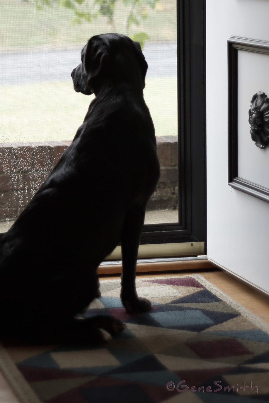
One thinks you cannot teach an old dog new tricks… I bet you will love this series- Here is a photo I took applying several of the things I learned and revisited from my early photography studies-
And here is the link: https://www.youtube.com/watch?v=y7HrM-fk_Rc
Camden, NJ Students gather to mourn lost classmates.
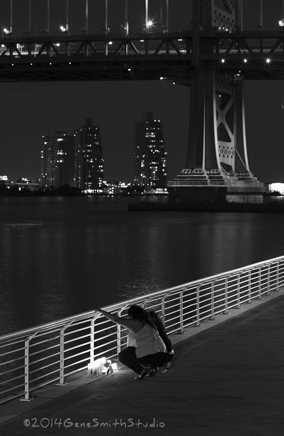
I was reminded of this photo I made a few years ago when I was updating my website today.
I had been commissioned to make a photo for a mural of the Philadelphia skyline for a giant worldwide engineering firm to decorate their new Philly office. It is the same photo you see in this website.
These kids were having a self-styled private service for the eight or more fellow students killed by gang violence and other reasons during the school year. I was the only ‘grown-up’ there.
As I wrapped up my commercial photo I asked If I could make a picture of them.
They graciously agreed and this is my interpretation of their actions.
Now is a Great Time for
Your Updated Headshot!
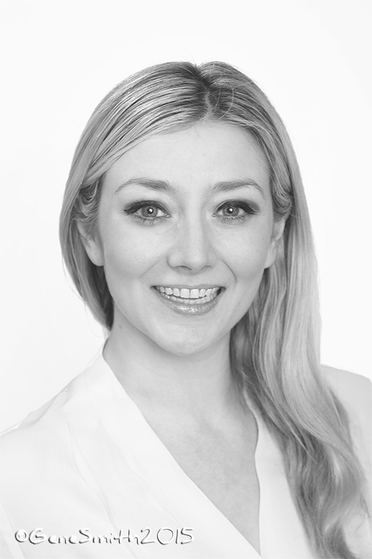
Sometimes it can be challenging to schedule everyone at a company for a photoshoot during summer vacation season, yet summertime is a fantastic time for individuals to get a new headshot.
Sun, fun and a relaxing vacation are just what the doctor ordered to make everyone look their best for a new professional portrait. I recently made a few new portraits for a marketing company and it is always great to see the glow from outdoor activity on my subject’s faces.
If you or someone you know is looking for a new headshot please give me a call.
How often should you get a new portrait? I tell folks it is smart to get a new portrait when they get a significant promotion or change positions at their company. An easy way for executives to remember to get an updated photo for Linkedin or other web-based sites is to make an appointment with me for a new photo when they get a new car… Most car leases are a few years and that coincides with changing styles and a new look for their business portrait. If you are a professional, your portrait represents your BRAND.
There is no better way to show your clients/customers you are current and professional than to keep up to date with your appearance and that means a great, fresh professional headshot. Here is a sharp young woman I recently photographed.
Doesn’t she look great?
New corporate headshot for XEROX-
I got a call to photograph an executive for XEROX. The assignment was interesting because the subject wanted me to drop his headshot into different skyline backgrounds from different portraits on my website. I swap people in group photos all the time to insure everyone looks their best, so cutting out a single person and dropping that portrait into a new background is something we can do. The interesting angle was the request to drop headshots into some PowerPoint backgrounds so the executive could use these “slides” in presentations he gives all over the country. I needed to get the PowerPoint files into a format that I could import into Photoshop to do the work I needed. I was able to import the files and my customer was thrilled! In this portrait I used a background from a Center City magazine cover I made last year and this is the result- What do you think???

Behind the Scenes in Atlanta, Georgia Photographing Figures for the Medical Text- The Balanced Body
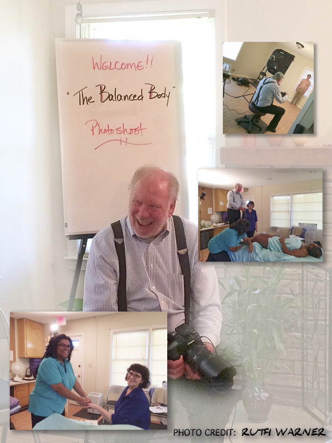
I do a fair amount of traveling for customers projects, and this trip to Atlanta was a great one!
I had an accomplished team of experts and that always makes my work easier. We were photographing ‘figures’ for a medical textbook and the subject was Medical Massage.
Our author Ruth Warner is working on a 3rd edition so she has the depth of knowledge that makes decisions on-set quick and decisive.
Our host Cindy Farrar- What can I say? Cindy is a Luv-Bug! We were provided with more than we could imagine and we really had a ball making these photos! Cindy really knows this medical speciality and with two experts on hand we really had it made.
Linda Francis ‘had the wheel’ from the publisher Wolters Kluwer and we sailed right through these photos making each one ‘tell its story’ about the technique, the body mechanics, and everything else a professional teaching text needs.
Day one was a long one with me leaving Cherry Hill at 3:00AM Monday morning, shooting the bulk of the ‘figures’ to get on top of the job and putting the camera down Monday evening around five-ish. We had a fantastic dinner and headed back to the Marriott for a deep sleep.
Tuesday was a romp and we had finished our last image by 3:00 PM! This is what a prepared and professional crew does- done early and done RIGHT!
Thanks Guys! I’m looking forward to your 4th Edition!!!
Architectural Photography
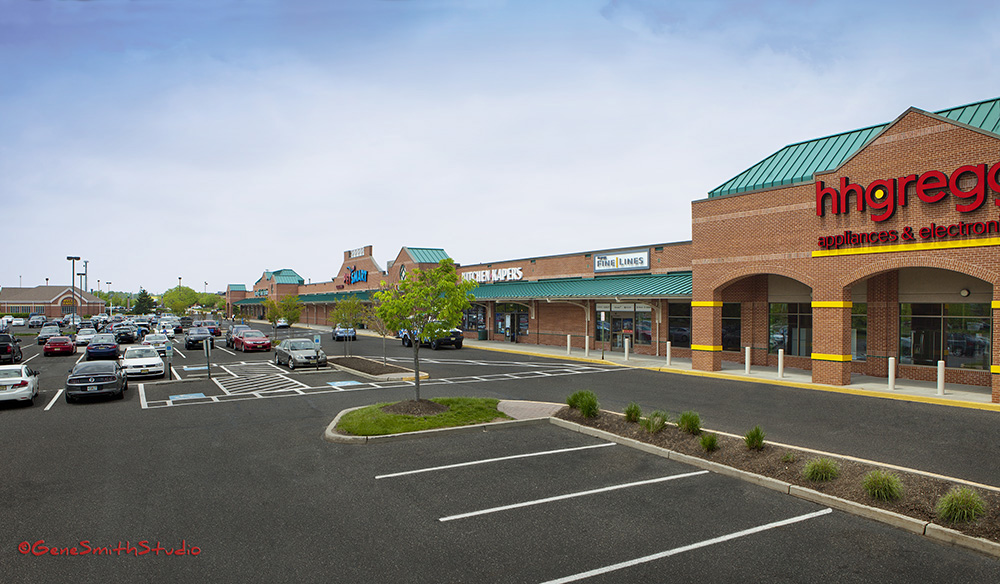
Back when Architectural Photography was mostly Black and White, and lensmen used film in sheets loaded in the dark into double sided film holders, I cut my teeth in Architectural Photography.
Lucky for me I had a couple of great mentors who pushed me to strive for excellence. We used huge bulky ‘box’ cameras that had adjustments for bending the lens board and film back to control perspective and focus. Imagine what happens when a Power Point projector is crooked and the projection is distorted- That is the same effect we used to ‘straighten’ perspectives before digital retouching was available. On these enormously expensive cameras the lens could tilt, rise and shift and so could the film back. These ‘adjustments’ were tedious and difficult. AND the image was projected dark and upside down on a frosted glass ‘viewfinder. This is the old-school photographer with his “darkcloth” over his camera to help him focus. Add that to the fact that you never really knew what you had till later when you developed the film and printed it and you have a recipe for disaster!
Today there is some ability to straighten perspectives with Photoshop but be advised any juggling of pixels degrades the final result. So even today, top photographers rely on special and very expensive ‘Tilt/Shift’ Lenses to make the photo’s perspective correct in the first place. I use some exquisite ‘Tilt/Shift’ Lenses from Canon and also Zeiss in Germany.
I am the ONLY American Photographer with the Zeiss Hartblei endorsement in Germany! You can see my photos on the German Zeiss/Hartblei website in Germany- Gene Smith Featured on Zeiss/Hartblei Website in Germany
Some folks in art, music and other creative pursuits think one needs to ‘specialize’ to excel. I’ve always felt being a generalist does not detract from any speciality. If you have ever seen that short clip of Jimi Hendrix playing an acoustic guitar you’ll surely agree.
So many times I’ll take an experience from one discipline and apply it to another- Like the time we fabricated an aluminum bracket to hold a orange slice up within a glass in a food photo of a parfait! My very well paid food stylist sure liked me pulling his reputation out of the dirt…
Diversity- Give it a try. The truth is it shakes out cobwebs and makes any specialist stronger!
Now is a great time to photograph architectural exteriors.
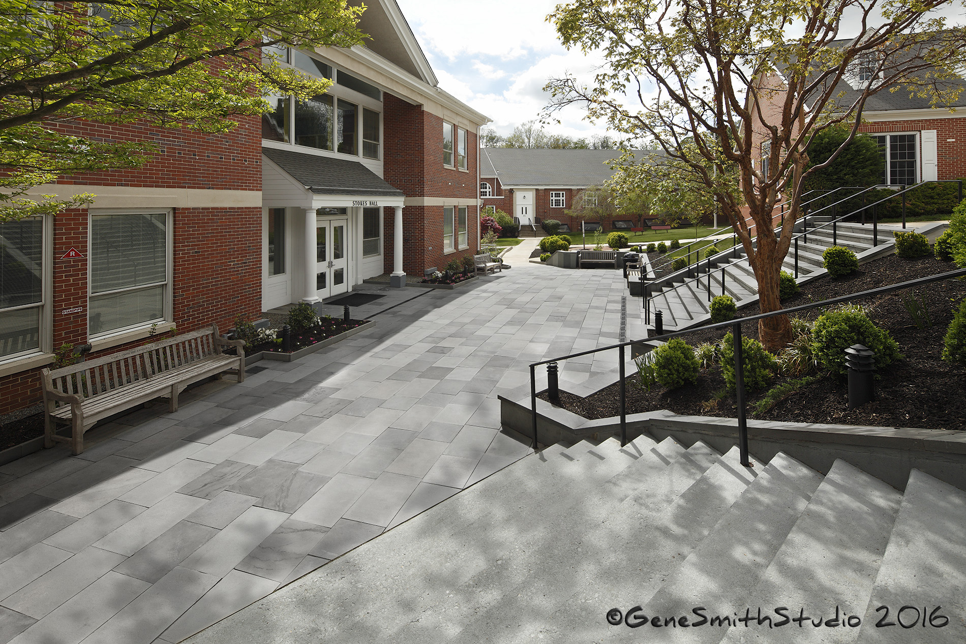
I made this photo for Jefferson Moon AIA and TAO Architects of this new courtyard for Moorestown Friends School.
The stone is all real Blue Stone and it really looks fantastic. The courtyard is designed to be inviting for students to gather featuring the alcoves with nice teakwood benches. Under the Blue Stone is heating elements to melt snow in the Winter!
I had a chance to use my 17MM Tilt-Shift lens on this one and it was something quite different to shift the image downwards to keep my perspective straight. Usually we are shifting the lens ‘up’ to get the top of a building in the picture without tilting the camera up ruining the perspective. This time we went the other way!
Using tilt-shift lenses is the very best way to make accurate yet pleasing architectural photos.
I cut my teeth using big 4X5 and 8X10 cameras making architectural photos while still in college.
We travel a little lighter these days but we still use the Scheimpflug Principals to hold focus and control perspective.
Canon makes a fantastic 17MM and of course Zeiss in Germany makes tremendous Tilt-Shift lenses too.
I have the Hartblei/Zeiss optics endorsement in Germany and I’m the only American Photographer with this endorsement-
You can see more of my tilt-shift photography on the Hartblei/Zeiss website in Germany.
http://www.hartblei.eu/en/customers/genesmith.htm
Along with our classic studio portraits and headshots we offer these environmental portraits on location.
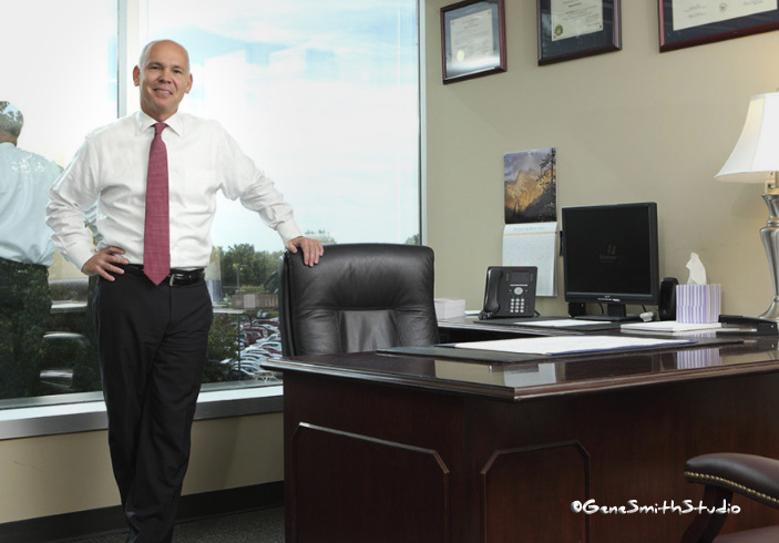
Sometimes we have a beautiful location like this one and we can make a portrait that tells a story about the subject and what he does. Other times we can make the portrait anywhere and drop the subject into the background we choose. There is more to it than merging two photos and we make sure the two images complement each other in tone, lighting and pose.
A young mother takes advantage of the stellar weather we have enjoyed in New Jersey this Autumn-
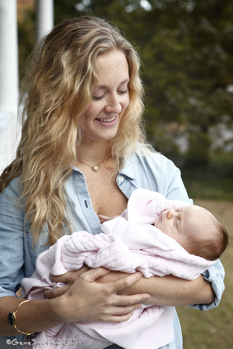
Often the natural light of an overcast evening is hard to beat. When you want to make a nice portrait always look for an overhang (tree, roof or porch) to block the light from above. This Victorian home I was working at in Cape May, NJ last month had a big porch that provided this perfect light in the evening. Notice there is no hard shadows under the mother’s eyes that one usually gets from overhead light. All it takes is something to block the overhead light while still offering directional light coming in from the side. When working with a full crew (at great expense) on a commercial photoshoot we craft the light with scrims, flags and tents to create this directional but Heavenly light outdoors. All YOU need to do is work with what you have… Look at what the natural surroundings provide and adjust your expectations to fit. I was not planning this particular photo- BUT I knew it was a winner when I saw this beautiful mother with her less than a week old infant glowing in the soft yet directional sidelight offered here. This skylight is a little blue- but that is no problem for modern digital work. With film… the camera lens would’ve needed an image degrading color filter to get this pleasing color.
Remember to include a casual photo with your Headshot Session.
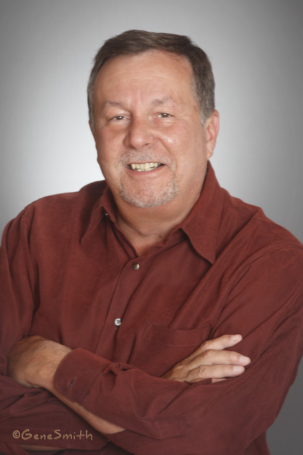
I like my Corporate Portrait subjects to bring a casual outfit with them when they are getting their professional headshot done. It isn’t any more trouble to adjust the pose and lighting to include a casual portrait and there are many uses for a casual picture as well. I like to get the corporate photo finished and approved first. That is easy because when you have me make your photo, you can see the picture on my laptop right away so we can judge “what we like and what we want to change”. Here is a recent casual photo from a CEO’s formal Corporate Headshot for an alumni award. Think about it- It brings more value and I’m happy to show a more casual side for many other uses. Do you want to truly look great? Call Gene!
Old School Magazine Production (1989)
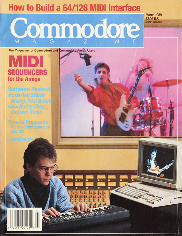
Here is my nephew Geno featured on a magazine cover I made at Pete Donahue’s Labworks Studio back in the day. I spoke to Pete the other day and we laughed at the way technology has marched on- This photo composite was made from three film transparencies, scanned and composted on a million dollar Si-Tex digital computer in Texas. When I was working in ’89 for accounts like Commodore, Dupont, International Paper and MATTEL we used film in sheets for maximum resolution. At that time I didn’t have a MAC for photography. It was a few months later that I got my first Macintosh Computer. I still remember the MACs little stopwatch icon spinning away (a note to take a break) while it’s processor swapped every pixel in a memory-crunching “Rotate Canvas”. Today’s “machines” do it in a blink of an eye.
Random Access Memory RAM was over a dollar a Megabyte and “car phones” were in a big bag.
It is certainly different now- but a great photo is still one that “Tells a Story”.
Art, Craft, and Expertise
For me nothing is quite as exciting as watching someone who is an expert at what they do.
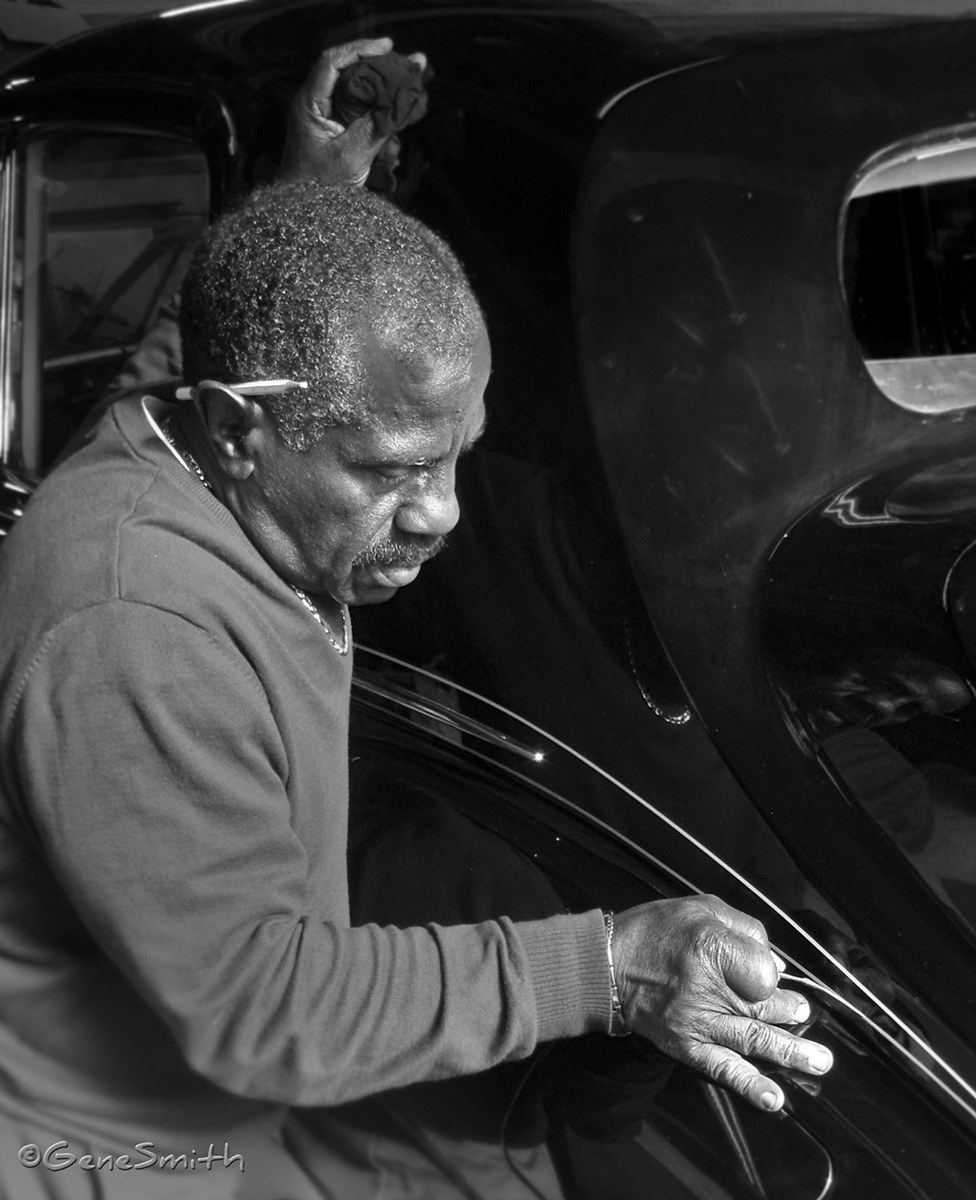
Now is the perfect time of year to catch up on environmental portraits in the executive office.
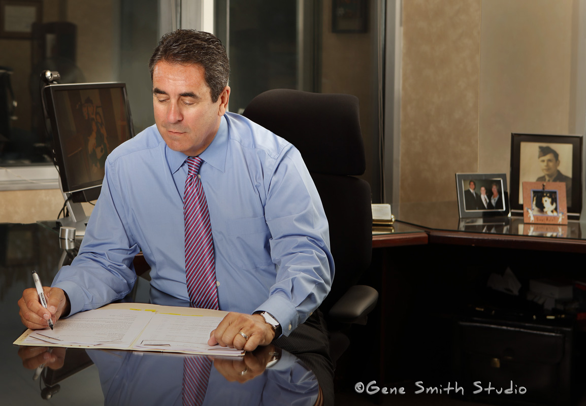
Now that Labor Day is a distant memory and Halloween decorations are popping up everywhere it is a perfect time to schedule new executive portraits for the company website. With folks still glowing from summer vacations and before the frigid weather takes its toll on everyone’s complexions now is the time to CALL GENE.
When professionals look competent and fresh it is a GREAT reflection on the firm. Search Engine Optimization requires careful attention to updating the company website, and what better way to stay at the top of GOOGLEs organic search than to make new content featuring the executive staff looking their best.
A professionally styled and photographed portrait shows the world that YOUR firm is on top of its game. If your corporate portraits and headshots do not look as nice as these there is a solution…
CALL GENE! 609-870-6727
A Fun Engagement Portrait for A Young (old) Friend at Cape May Vineyard-
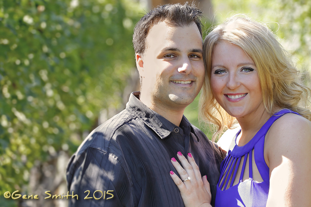
I have a very good old friend who I have collaborated on advertising and editorial projects for over 30 years. When I met Larry he was working at a small publishing firm in Southern NJ. Today Larry is in charge of art and design for one of the world’s largest publishing and media firms. I have known Larry’s daughter Melissa since she was born. A few years ago Larry told me Melissa wanted only me to photograph her upcoming wedding…
I have photographed many weddings, mostly when I was a lot younger and occasionally now for my close friends and my nieces. I so look forward to Melissa’s wedding.
All the Best Mel- You two look like a Trillion!
A Great Alternative to the Ubiquitous Beach Portrait
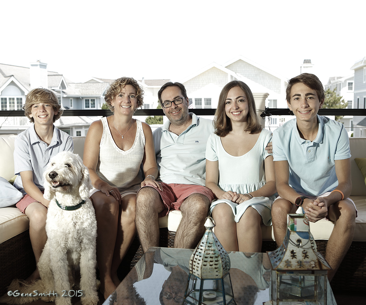
I had the pleasure of photographing this family in Avalon, NJ last week. It was a single opportunity to have all the members of this family in one place at the same time.
We all love the Beach Portrait- and this family wanted something a little different. We decided to make this portrait right at the brand new beach house just yards from the ocean in Avalon, NJ.
Working in Cape May, NJ
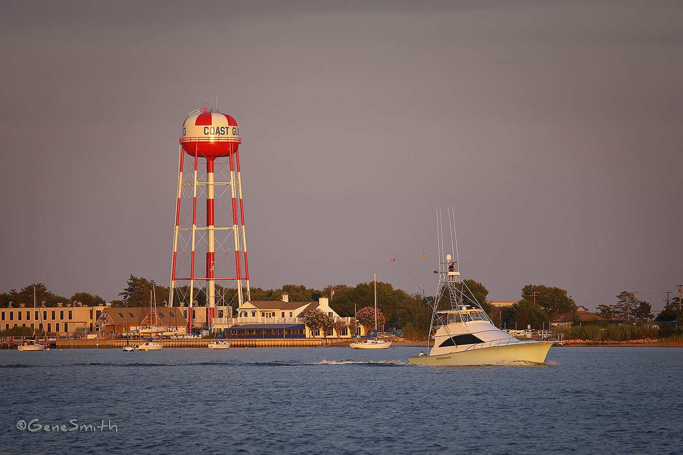
I am often commissioned for assignments in Cape May, NJ. From assignments for top boating and lifestyle magazines to commercial photography and portraits, we love “working” in Cape May!
I made this pretty portrait of The Corinthian Yacht Club, Cape May, NJ and Coast Guard Station Cape May’s newly refinished water tower on August 1st 2015.
While important as maintenance of the Coast Guards infrastructure, this big red and white water tower is also an important Aid to Navigation to vessels cruising offshore Cape May in the ocean and in Delaware Bay.
The tower has been under wraps, covered in safety scaffolding for a long time shrouding its visibility offshore. All sailors welcome back this important point-of-reference and great landmark of Cape May, NJ!
With today’s electronic navigation, some folks forget what an important reference this grand old water tower is. I’d rather see Coast Guard Station Cape May’s wonderful tower’s glory on a snotty day offshore, than some glowing screen subject to failure from so many causes!
Welcome back Old Friend!
Top Firms Count on Gene Smith Studio to Make Their People Look Their Best.

When your potential clients or customers are comparing different companies or firms to see which group is a good fit for their business they always are influenced by a first impression. A fine portrait by Gene Smith is so important to represent your firm’s brand.
I have had the pleasure of photographing so many folks in so many different styles that I have learned to not only make everyone look their best- I am also constantly refining my portraits to insure they reproduce correctly, small, big, in color or B&W. It is not simple to get great lighting, great expression and the necessary depth and dimension in a portrait all at once so when reproduced in different print media and the web it always reproduces perfectly. These are some of the things that separate excellence from a lucky shot.
My portrait customers are sometimes surprised that I do not make as many photos as some of my colleagues need to in their sittings. I photographed a large firm’s CEO a few months ago and after ONE photo I felt we were done. Most corporate folks are busy and appreciate a photographer that is competent and can get the job done in a timely manner-
This gentleman was flabbergasted when I told him we had what we needed after ONE SHOT!
I always have a laptop tethered to my camera to show the portraits immediately after the shot is taken, and when this subject saw the result of that ONE SHOT- He was very pleased. His portrait is on this website and I challenge you to figure which one it is.
Kinesiology Medical Text Photography
I had the great pleasure of working with Dr. Carol Oatis again, this time on her 3rd Edition of KINESIOLOGY for Wolters Kluwer.
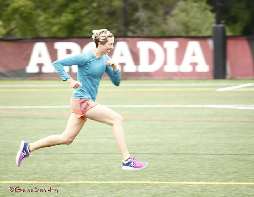
We have worked on the first two editions of this popular Physical Therapy textbook and it was great to get back to Arcadia University and see Dr. Oatis and her enthusiastic student models. We were able to re-use many of the 10 year old photos that were used in B&W in the first two editions. I had photographed these figures with color film back then and I scanned the film and supplied B&W digital files for publication. Luckily I had archived the color scans and was able to supply many of these images. The second edition was photographed with my first portable digital camera that made 6.3 Mb files. Last week we made color photos that were a full 60 Mb! It is always fun to work with the enthusiastic students. Dr. Oatis has so many positive and competent students we never have to go outside the University for models. This photo shows a runner’s gait and it was important to get both of her feet off the ground- I was reminded of Edward James Muggeridge’s “The Horse in Motion” and his work photographing horses running in 1878! In those days no one knew if a horse ever had all four feet off the ground at the same time and Muggeridge proved for all time that horses DO have all four feet in the air during a gallop. Painters of the time portrayed horses with one foot grounded in those days… Science and photography showed what the human eye could not perceive!
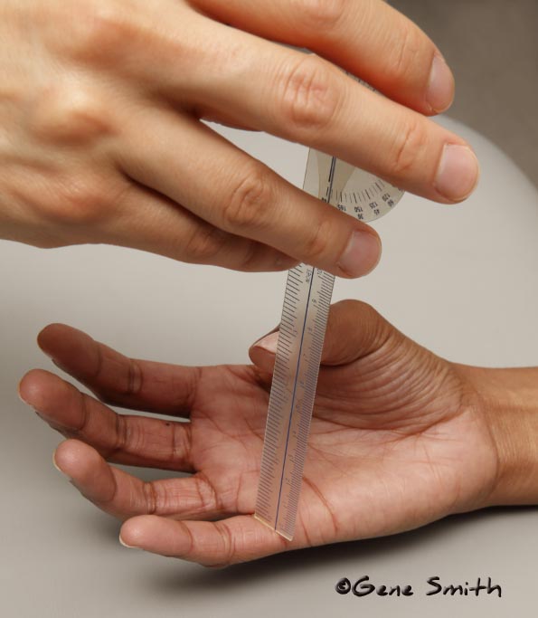
This photo shows the tools Physical Therapists use to measure a range of movement. This photo looks straightforward but it has several challenges- focus close-up like this can be tricky as it is almost a MACRO photo. The scale must be readable along it’s axis and it is also helpful to see the thumbnail behind the translucent tool and it’s relationship to the scale for measurement.
Graphic Designer Ken Barlieb
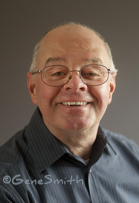
I made this professional headshot for my old friend Ken Barlieb for his new website last week. Ken is an artist so I wanted to use a very natural look that is a little less slick than the one I use for other professions. Luckily as an artist Ken was willing to use natural light and we made this portrait against a bank of windows with no studio lighting at all.
Sisters
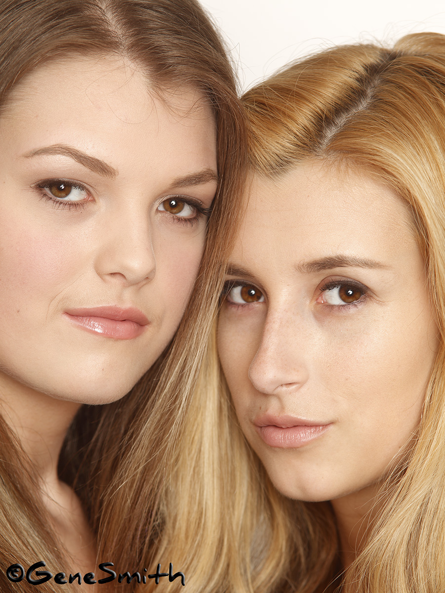
My excellent makeup artist Debbie asked me to photograph these two young women for their modeling portfolios and this photo was one we made at the end of that session. Many times an unplanned photo is one that ends up having a great result. These women are sisters so of course we wanted to get a shot of them together. We only made a couple of frames of the two of them and this photo is the one I like best- The photo was made with a very special lens I use for my portraits and headshots. This special lens and the lighting I use results in portraits that require next to no digital retouching.
Having gone through the experience of moving every pixel in a photo “just because we’re able” I am loving returning to my old-school roots from when there was NO retouching!
When I used to make 8X10 transparencies (film) for MATTEL toy package designs there was no digital retouching except for brutally expensive SiTex work done on a few workstations throughout the country. Film was scanned and then the digital files (stored on obsolete digital media called Zip disks!) were “overnighted” to these retouchers that had the million-dollar computer workstations and SiTex software. Needless to say the costs of an unseen fly-away hair or other overlooked problems after the film was processed and the models, art directors, stylists and clients flew home were out-of-this-world!
The other alternative, if there was something we wanted to change, was to send a duplicate of the actual sheet of film up to Manhattan and there a very skilled artist would bleach away the part of the image needing retouching. And then, with KODAK dyes that were comparable with the very fragile film- paint in the new imagery. This was the technique preferred by high-end advertising and top magazines and is where folks get the “airbrush” idea about retouching… Actually the airbrush was used for Black & White. The KODAK dyes were much more difficult and EXPENSIVE! ‘Better send a few extra of the costly “DUPES” up there in case the artist blobs out a face- remember there is no computer “un-do” button with real bleach, paintbrushes and dyes-
Now we have come full circle from the sterile completely retouched and smeary digital Photoshopped imagery to a fresh reality image that I just LOVE.
Of course there is a lot of Old-School lighting and photographic tricks of the trade used to make a natural looking portrait like this possible. Not too many photographers are able to do this. The few who do have the skills and equipment seem addicted to Photoshop and the reliance on “fixing it in post” or applying hackneyed Instagram processes.
To see YOUR natural beauty without a canned “shot-at-the-mall” look give me a call today!
Behind the Scenes-
Here is an opportunity to see my expert makeup artist Debbie working with me to make a fantastic headshot. I’m using state of the art glamor lighting and a very special old school portrait lens that gives me the wonderful results we loved from Hollywood’s great masters. This creates real beauty in portraits that I believe are fantastic. See if you agree this approach is so much better than the plastic “wax museum” look some photographers use in their automated retouching. Sure it takes more time and expertise. My customers think it is worth it!
Gene At Work-
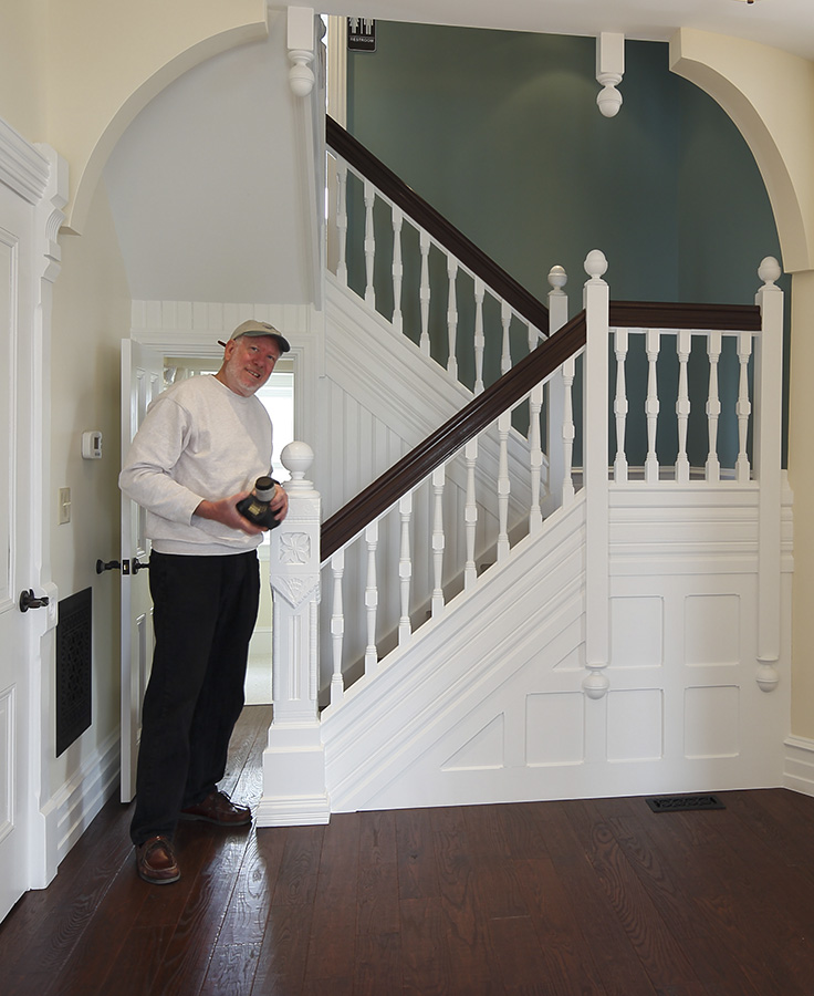
I’ve been hard at work making slideshow videos to add to my website and going through many of my favorite assignments for material. I came across this photo of ME taken by Jefferson Moon, AIA, on a location architectural photoshoot last year at the Ruth Bennett House in Chester, PA. This restoration, funded by the Pennsylvania DOT, was directed by Jeff. After the project was finished we spent a couple of days visiting the House and school to photograph the renovation. Jeff’s attention to detail and use of classic materials made this a very photogenic project. A little known fact is that Dr. Marten Luther King ministered here at the Ruth Bennett House while still studying at the seminary in Chester Pa. We were lucky to get into the House before the local historic society added the period correct furnishings. This gave us opportunity to show the construction and renovation details. As we were wrapping up a photo of the main entrance Jeff made this picture of ME!
There are more photos of this project on my website. The project won a prestigious award from the Historical Society- I’m glad my photos told the winning story!
A Testimonial That Keeps Giving:
I got (another) call today to photograph an author for a book jacket. While discussing the assignment and its parameters we agreed to have my make-up artist Debbie Hibbs join us to handle the make-up. Debbie is fantastic and we are going to have a ball next week when we make this photo. While talking to my customer about her books I was reminded of the book work I do for Dr. Carol Oatis, PT, PhD for her Kinesiology series for Wolters Kluwer.
Dr Oatis and I have worked on these texts for over a decade! We shall start her THIRD EDITION in early May.
It is so much fun to work with Dr Oatis and her crew at Arcadia University. Dr.Oatis is quite a sailor herself and we have a grand time relating our work to the language of sail. I so look forward to this assignment
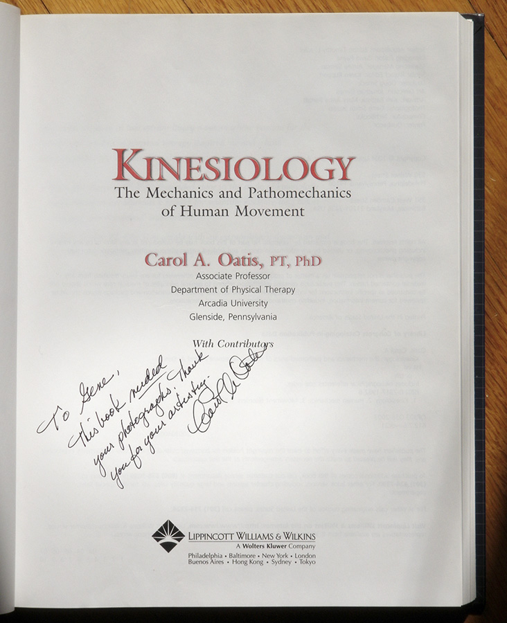
Here is what Dr. Oatis thinks:
A Perfect Testimonial:
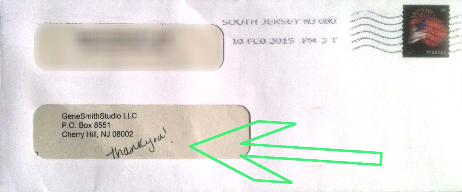
This was waiting for me in my P.O. Box recently. It is always nice to get prompt payment, and this little annotation of “Thank You” made my day!
Working as a freelancer has its perks. What most do not see is the business side of working in an art related business.
Naturally, I love my customers, and when I get a sincere “well done” like this one it is MAGICAL!
Thanks GUYS!
New Corporate Headshots for
Smith Publicity
I have had opportunity to photograph a really handsome group lately and I’ve just finished up the Black & White conversions. This client choose a white background and that works very well on their web pages.
I was very lucky to have Debbie Hibbs back me up with the makeup. This group didn’t need much help on the front-end (makeup) or the back-end (retouching), yet having a professional makeup expert is always a worthwhile option. I love working with Debbie. She has a great personality and folks trust her. It is really great to have an experienced and talented makeup artist, and it is also KEY to have a little time before the portrait for my subjects to cool-out and relax. Debbie has that nailed. I can always tell folks are relaxed and ready to make a fantastic portrait when they come into my lights from Debbie’s chair. Thanks again Debbie!
We also had a terrific liaison at Smith Publicity- Brittney Karpovich. Brittney kept the wheels rolling and made sure we were on time and we had everything we needed. Thank you Brittney!
The majority of folks at Smith for this photoshoot were women. I came prepared with my glamour lighting kit, needing only an additional small light to optimize the lighting of the men. We kept the lighting simple and elegant so we could push the lighting any way we wanted to make everyone look their best. We photographed in color and then I used the three digital color channels to create tones in B&W that resemble the beautiful tones we knew from B&W film. Each complexion requires a different treatment in the conversion from color to B&W. Just as in the tedious manipulation of film, developer, time and temperature- and the “performance” of the negative in the darkroom, the digital process offers mind boggling possibilities.
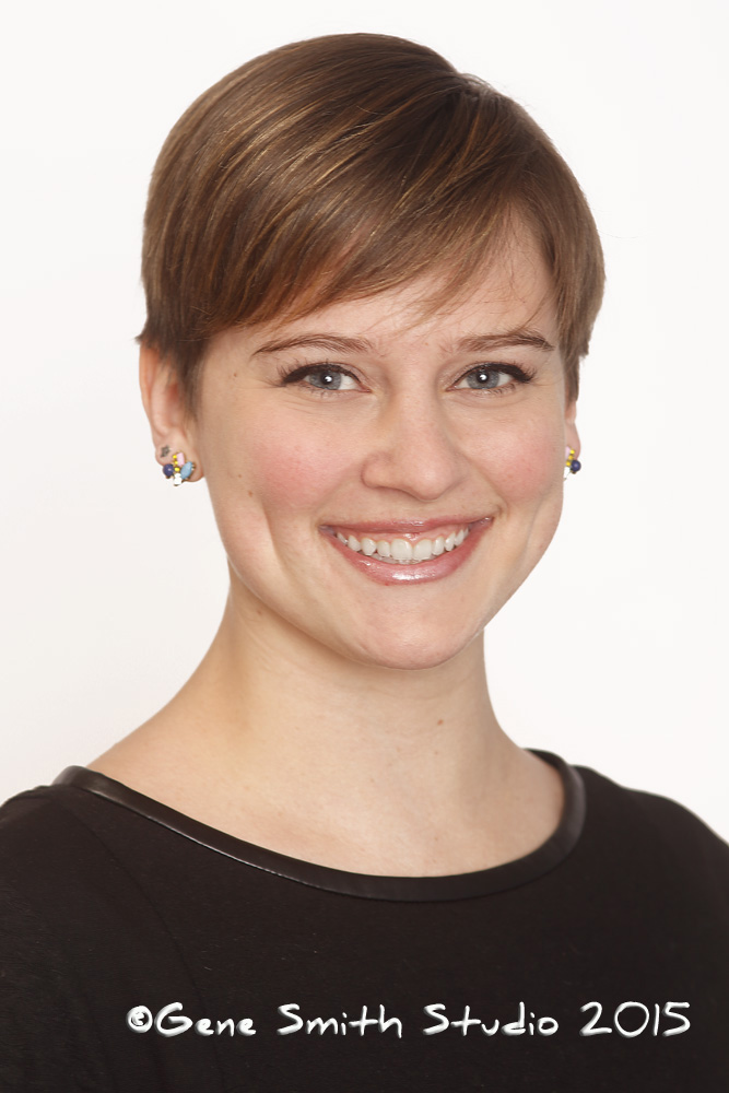
Here is an original COLOR digital photo portrait that was made with the intent to convert to B&W- It stands on its own in COLOR but it was specifically made with B&W in mind.
…And here is the final B&W photo as used on the client’s website-
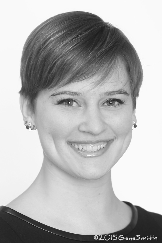
…And here’s another- Alexa for Smith Publicity :
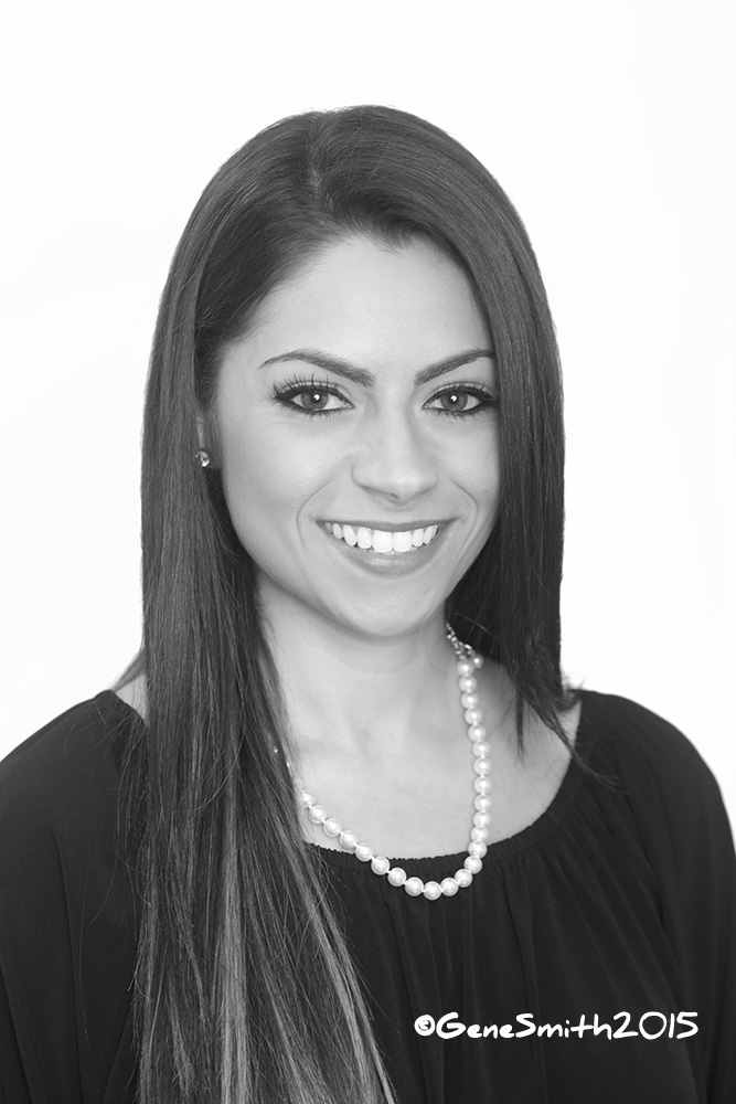
Feel free to visit Smith Publicity directly. Here is a link to all the photos on their website:
http://www.smithpublicity.com/about-book-marketing-company/staff/
Philadelphia Bar Association’s New Chancellor
Albert S. Dandridge III
I made this photo at Mr. Dandridge’s Office at Schnader in Philadelphia. Mr. Dandridge enjoyed himself and we made several different photos to tell a story about the work Mr. Dandridge does at the firm and his other activities.
Mr. Dandridge is a decorated Vietnam Combat Veteran with the U.S. Marine Corps and was awarded, among many honors, the Bronze Star with Combat “V” for Valor and the Purple Heart.
I always research my portrait subjects before I meet them so I knew Mr. Dandridge was an American Hero and an accomplished attorney.
He was also a gracious subject for our magazine cover.
Thank you Mr. Dandridge!
Meredith Z. Avakian-Hardaway the Director of Communications and Marketing for the Philadelphia Bar Association acted as our Creative Director. Meredith knows her way around the Philly law scene, and she was instrumental in getting us the access we needed. Meredith was even able to pull another additional attorney into our photoshoot to tell the story about Mr. Dandridge’s involvement with war veterans who work in the law field! This was instrumental in us getting an additional shot we needed. Thanks Meredith!
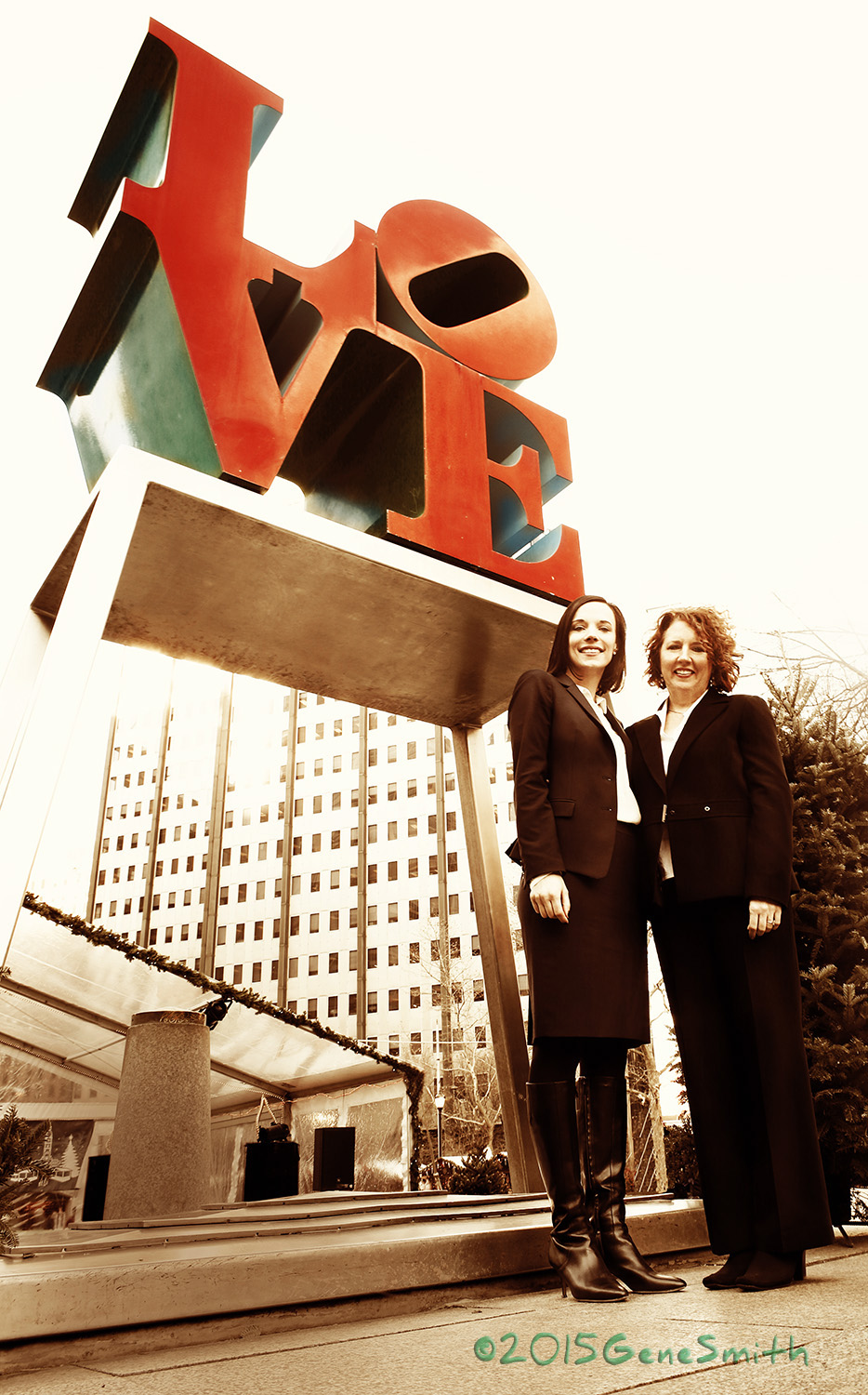
LOVE LOVE LOVE and Giving Back In Philly’s LOVE PARK
I was thrilled when Duane Morris’ Josh Peck called me to illustrate the good works of Duane Morris’ Pro Bono Team. We had some buttoned-up ideas for a photo when “Kat” Christian McGee and Valentine Brown came up with this great idea for the firm’s Pro Bono branding.
It was the week before Christmas and one of those really frigid days when we needed to get this photo made. Boy were we caught off-guard when we arrived at the Park and it was decorated for Christmas and filled with vending stands for a Holiday Event!
Quickly, I remembered what a Philadelphia Inquirer staff photographer had taught me 40 years ago when I was just starting out in this photo business.
Do something DIFFERENT- “If everyone is at eye level get higher-“ Well THAT wouldn’t work so I considered the opposite.
I had my tiny Olympus 21mm lens with it’s Canon adapter because I had planned on a forced perspective. Off came my coat onto the cold granite and I got down on the frozen ground and made this “earthworm perspective”.
What a perfect way to showcase the Giants at Duane Morris that operate the Pro Bono works of the firm!
You GO Guys!
Click Here to E-mail Gene
Customer Testimonials
HOME
